Sunday, May 31, 2015

One Shot: Victorian Coat

    Finding the resource of the Fenimore Arts Museum in Cooperstown New York has been a great blessing.  Their growing collection is being presented piece by piece on line through a tumblr blog by their young curator, and its clear they have no issue whatever with this. Smart folks, really.
    Recently this wonderful item showed up there.
    Though much remains of the dresses of the time, few outerwear garments exist, mostly because they would be re-styled, and worn till worn through.  This coat, which by its shaping places in the mid 1860s, is a wonderful survivor.  The short position of the waist is consonant with the shorter waistline of the crinolined shape in vogue, and the wide sloping cone shape of the coat skirts would have fitted correctly over the breadth of the dress skirt.
    One of the other cues to this garments age is the scale of the bows and other decorations.  The vast size of the skirts in fashion, (soon to collapse into teh first iteration of the bustle), required larger scaled embellishments in order to look balanced, so the cording, and the bows, which might have looked cartoonish as part of another silhouette, look appropriate on the swelling dome of a crinoline.
    Made up in navy cotton velvet, with a gray, quilted silk taffeta lining, this coat would have been meant for fall or winter, and would have been appropriate for visiting, shopping in town, or a carriage ride in the park.
    The decidedly military style of the decoration was quite popular, partially as a response to the widespread unrest in Europe and in the USA.  Since this coat is probably contemporary to the American Civil War, showing a patriotic militarism in dress would have been thought only natural.
    This coat was worn by New York state native Charlotte Prentiss Browning (1837-1935), so she would have been in her late 20s to early 30s when she wore this lovely coat.
    I wonder what she wore it with?

Saturday, May 30, 2015

Scatter #57

    It has been a whole month since I did one of these posts.  So settle back and enjoy the ride through the tangled underbrush of my noggin.
   We all learn languages early, in the most formative part of our youth, birth to 3.  And even with the Attire language that process holds firm.  It doesn't matter that for the larger part of the world, small children don't get the luxury of choice in their clothing, but they are busily learning the syntax, and subtextual meanings, nonetheless.  So by the time they are adults, they have a well formed understanding of the potentials of the vast vocabulary that we have to hand.  This small girl is already learning what the language means, and what it does.  Sure, she is being guided into gender normative patterns because of the skirt and top, the earrings and sunglasses; but whatever she has on, the base line consideration here is, though she does not know it, and her parents likely have never considered, that she and they are taking active part in mastering a whole new manner of expression.

     Speaking of mastering a language, here is another person, now adult, who has not only learned the language, but is using it skillfully to present a particular image of himself as a stylish, but dependable and responsible person of business.  The classic London business man tropes of bowler, precisely cut suit, brolly, and valise are all present, its only the cut of the suit, and the style of the valise that cue us that this is more than a cardboard cutout of a classic professional Londoner.  Though this man chooses to slot himself into the business community, he is still able to express, albeit subtly, his own away from work tastes.  And having just returned from England, and a week of it in London, I can tell you that men like this do indeed walk the streets there.
   
    Not only were corsets still routinely worn, well into the 20th century, but there were indeed multiple styles and types of corsets for differing looks and activities.  A lady about to engage in a tennis match, would still wear one, but it would be more loosely fitted and would have fewer bones, to allow for more mobility, but a lady about to dress for a formal dinner or reception, would be as tightly bound as could be done.  Since at such events women were mostly seated, or simply standing, the tighter lacing would have been bearable. Also a certain vanity about presenting the best possible impression would have prevailed, making some discomfort, a needed, understood reality.
   
    This is a 3rd century bust of a Gandaran Bodhisattva.  Even within the presentation of deity and holy personas, the hand of Attire is present, affecting the eventual look.  Of course this image refers accurately to the ideals of Indian male beauty, but its the presence of the moustache that shows the hand of the Attire language at work.  Facial hair fashions changed in India over time, just as in any other culture; so the presence of this particular type of moustache is a marker of its particular time, and the prevailing mindset about male attractiveness.
   
    Julien Fournie, in the S/S collection for 2015 showed the runway pieces decked with massive, overwhelmingly large, complex jewelry.  The intensely red piece here has a strong ritual feel to it, since its like a separate garment, in the way it wraps the torso.  Real world useful?  Not at that scale.  But I could imagine something scaled down working in actual life away from red carpets, and the Met Gala.
    Here I go with that Avant Garde thing again.  This one is pretty mild mannered, really.  designed by Julia Galdo and Cody Cloud, this tunic and pants breaks the mold of proportion and pattern scale for menswear.  It also falls squarely in the gender free zone, since this could be equally worn, without alteration by any person so inclined.  The tunic, I could see as quite adaptable to many people and in many textiles and patterns.  The pants are tougher, because of their length, but they could have considerable use as well.  Thoughts, folks?
    This close up image is of some bead work from Kenya.  What struck me, and it has resonance to my recent trip and a conversation I had there, is that in every culture of the world that does bead embellishment, the seed bead application you see on the horizontal band is in use.  It is an Attire universal crossing centuries and borders.  I love things like that. Sigh.
    More and more men in western culture are allowing themselves the license to play with dress up, make up and fantasies of visual presentation that decades past they would not have permitted themselves.  Frankly I can only applaud that, for what it implies about changes in men's internal attitudes about themselves.  And as a part of the Attire dialog, having more ways to express can only be a good thing in the end.  Three attendees at a botanically themed party.  Me likey.
    Found in Suffolk, England, this object is a gold and enameled purse lid from the early 7th century AD.  Its referred to as the Sutton Hoo Purse Lid, for the exact place it was discovered.  it shows extremely high workmanship, and very fine detail, even to the crosshatching within some of the blue enameled sections. The design style is straight up Celtic, and the condition, nearly perfect considering its age.  Wanna make sure something lasts through time?  Metal wins, every time.  This lid would have been attached, with its accompanying frame ring, to a leather, or textile pouch; and worn at the waist.
    More Avant Garde, cause I can't help tweaking things a bit.  Nikoline Liv Andersen designed this rather extraordinary ensemble.  Part bird, part fruit basket, part African tribal ritual costume, this climbs over the fence from avant garde's house, and into the backyard of wearable art.  The densely layered textures, and strangely skewed proportions are all really intriguing to me.  I would love to have the opportunity to see this in real time, I bet its amazing up close.
    I have loved this film, Some Like It Hot, for many a year, in part because I saw it at the Castro Theater on a Sunday afternoon on a double bill with Victor Victoria, accompanied by Sister Missionary Position of the Sisters of Perpetual Indulgence on my first visit to San Francisco.  But I had to include this in the mix today because of a tidbit relayed by Tony Curtis regarding the costumes for he and Jack Lemmon.  Originally the idea was to pull costumes from stock for Lemmon and Curtis, but they approached designer Orry Kelly, who was slated to do Marilyn Monroe's costumes and pleaded with him to do their dresses too.  He agreed, and the result was delightful visually; and doubtless helped the actors performances, since the clothes were truly right for the characters, and action.


    Bringing up the rear, courtesy of the Fenimore Arts Museum of Cooperstown New York a selection of costumes designed by Marc Chagall for a 1967 production of the Magic Flute.  The hand of Chagall is clear in each one, with his unique artistic vision undimmed by the requirements of opera costume.  In order top to bottom: Pamina, Papagena, Sarastro, and the Queen of the Night.  Brilliant costume work, from a consummate artist.

That's it for this week!  Enjoy your weekend all!

Friday, May 29, 2015

Blythe House, The V&A, and Me- Part Three

    Rounding out my tale of my experience at the Clothworker's Centre at Blythe House is perhaps the most perfect example of the Robe a la Francais style of the 1760s, known more commonly in England as a sack back gown, for its voluminous, stacked pleats from the shoulders.
 

     The tables in the exam room had been covered entirely by the other three items I had requested, and they had actually forgotten about the sack back gown, so Sarah had to request it be brought.  While we waited she packed the velvet coat and waistcoat away, so I got the opportunity to watch how its done.  Mostly its about moving slowly, and being always conscious that nothing is being pulled, or twisted as its being hung up.  The hangers are only used for transport, nothing is stored hanging.  So when an object gets back to its proper place, the tyvek bag is opened at the top, and the hanger, removed, before it goes to its storage drawer.
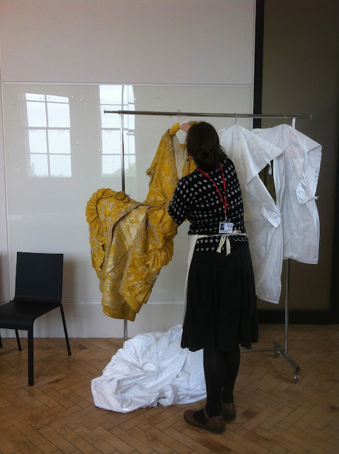
    In a few minutes the door opened and a rolling rack came through the door, with the two pieces of the gown each in white tyvek bags.  Sarah has explained when I asked that they use tyvek exclusively now for storage, because dust and dirt can't penetrate it,  its easy to clean the surface of it, and its very tough.
    So, the first bag slowly gets opened and emerging like some fabulous butterfly is this incredibly brilliant yellow gown.  I had chosen this particular piece because its is so perfectly the style of its time, both in structure and decoration, its like a basic textbook illustration of the period's preferences.
    Sarah carefully laid it out on the table, arranging the skirts, and sleeves so they wouldn't get inadvertently crushed, and I approached.  What surprised me most as I looked the gown over, was the perfection of its condition.  Other than some soiling on the rear hemline, there were no stress fractures at the seams, no missing trimmings, no rips. This was the real thing, unadulterated, which was just what I wanted to see.
    The gown was of English manufacture, and the figured yellow and silver silk brocade was made in Spitalfields, London; the biggest center in England for silk textile production.  The decorations too were the baseline type. Everything about the Rococo style emphasized curves, so the robings, (the trimmings that go down either side of the gown's front edges) are a continuous series of ess curves.  And the only other embellishment, beyond the self trims was the overlaid white silk fly fringe, which, miraculously was undamaged by time.
   
    During this time I mentioned a famous painting by Francois Boucher of Madame de Pompadour that is, apart form its color, very similar in how its decorated.  So Sarah jumped on her laptop and pulled it up to compare, as she was unfamiliar with the painting.
    The last series of images here are some of Sarah packing the gown back up, so that she could lay out the underskirt for view, since that table was too small for both. And I caught a coy shot of the shoulder peeking out of its tyvek cover.  Sweet, really.

    So this rounds out my share about this amazing experience.  Sarah, if you are reading this, my very great thanks for your patient, sweet contribution.  To the Clothworker's Centre, many thanks as well.  Keep doing what you do, saving these fragile, ephemeral things for us to appreciate, and learn from.

Thursday, May 28, 2015

Blythe House, The V&A, and Me- Part Two

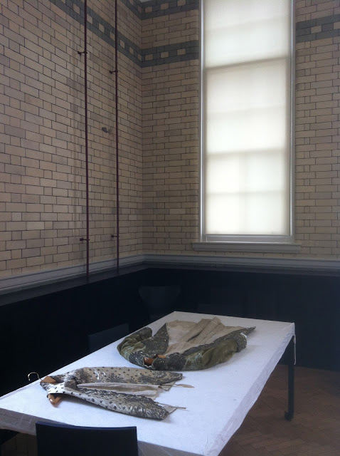
    For this next installment, sadly I have few images to share of this magnificent men's court suit.  I caught a few glimpses with my camera in the exam room, but the V&A archive has only one image, a close up of the embroidery work.  That said, let me move on.
    The table bearing the coat and waistcoat were literally the first things I saw as I came into the exam room. I let out a small gasp, truly.
    After finishing with the 1740s mantua I moved to the next table, a truly impressive men's coat and waistcoat of the 1780s, so it would have been contemporary to the reign of Louis XVI. The breeches are not in storage, and probably no longer exist.  But the coat, once of brilliant turquoise silk velvet, and the off white silk waistcoat were very much worth the time. 
    The coat's silk velvet had faded to a pale, nearly celadon green shade from its original hue, but this is quite common, since many dyes were unstable, and would begin to break down over time, changing color as they deteriorated.  In shape the coat was a perfect example of cut and fit for its day, and it clearly had been made for a nobleman of extreme wealth, and extravagant tastes.  The coat is spectacularly embroidered over its surface in silver metal embroideries, with metal sequins and glass paste stones, with silver foil backing.
    The beautiful sprays of flowers arc over much of the coat's surface, and the back, when Sarah turned it over for me, was perhaps even more spectacular, since the decorations followed the curving seam lines, from shoulder to hem, merging together at the base of the back.  As a side note, the coat must be quite heavy, not only from the velvet, but the amount and type of the embellishment on it.  It was obvious as Sarah lifted it, that it was a weighty thing.
    The waistcoat of what would've been considered white silk was similarly embroidered in silver, not an identical pattern, but one that was obviously chosen by the gentleman for its harmony with the coat decoration.  The work there was extremely fine, and much smaller scaled. 
    Another side note:  The coat and the waistcoat would have been embroidered by the piece on the uncut cloth, and then cut out and assembled for the client, and in many cases, such pre-done work included embroidered button covers to match.  In the case of both these objects, that was so.
    One of the many things that made this experience so wondrous was the interaction between me and Sarah, who was every bit as beguiled, and intrigued by what we were seeing as me.  And as we examined the coat, and saw that at the shoulder line, the velvet had been extensively, and expertly repaired we both wondered if the material used to fix it had come from the missing breeches.  And too, we both mused about what that coat would have looked like, with its silver embellishments untarnished, and the paste stones un-clouded, as the wearer moved about in a candlelit room.   Sighs of happiness.
    Tomorrow?  The Pencil box yellow Robe ala Francais.

Wednesday, May 27, 2015

Blythe House, The V&A, and Me: Part One

    So, clearly, when I said I was going to continue to post here, sporadically during my long UK adventure, I lied.  Unintentionally, but that's a fact.  Now that I have that admission out of the way, lets move on, shall we?
    Some of you know that I had managed to get an appointment at the Clothworker's Centre at Blythe House in Kensington, London.  Blythe house is the location where the Victoria and Albert Museum keeps its over 100,000 pieces of textiles, and garments, currently in their collection, when items are not on display, or on loan to other facilities.  Its also where new items get taken through the conservation process, cataloged, photographed, and stored.
    Located in a quiet section of Kensington, Blythe house itself is a vast Victorian building, initially built to house a Postal facility.  Now its home not only to the textile collection but also to the V&A's collection of furniture.
    Approaching the building, I actually felt a might daunted by the huge iron gate.  The sign on the gate said, "By Appointment Only, Buzz for Entry", so, I buzzed.  Walking through the forecourt, and then under an open space that was clearly originally for carriages to stop, I turned left, went up some stairs, and into the building to the reception area.  To get there, I had to walk past some workrooms, where I could see rows, and stacks of boxes, filled with pieces in storage, or being readied for conservation work.
    At reception, I was met by a delightful silver bearded fellow who gave me the run down on how things worked, gave me my ID wrist band, and told me that there would be a short wait before the worker I was assigned would be with me.
    Shortly, a young woman came to me, and introduced herself as Sarah.  She would be working with me during my appointment time.  She took me to a lift, and up we went to the 3rd floor; where the bulk of the collection is kept.  She guided me to a large room, about 20 by 40 feet in size, with a number of long tables, each covered in white tyvek.  And on each one of these tables, laying before me like treasures, were the objects (as they are referred to in museum parlance) I had requested to see.
    I know I have some facility with language, but I don't know really if I can convey accurately the depth of what I felt, suddenly being literally in arms reach of some garments that I had admired, and studied in photographs for many years.  It was something akin to being in the presence of a painting one has often seen.  But there was something more.  That something more was the instant knowledge that each of these things had had a life, an owner, and a history buried within their fibers, and folds.
    Sarah and I had already struck up conversation, and when she found out that I had been at this study for as long as I had, she brightened, since she has a museum background, but not a clothing and textile one, so she hoped to learn from me, as much as I hoped to learn myself.  That was an unexpected, and marvelous addition to the whole experience.
    The first object was a mantua dated from 174-45.  This astonishing piece had clearly been kept away from light over its long 275 year life.  The silk material was still quite sturdy, according to Sarah, and the extensive silk embroideries were as brilliant as the day they had been sewn.  Sarah gave me a large square piece of perspex, and a jeweler's loupe, so that I could look closely at any part of the mantua without touching it.
    The underskirt is decorated over its entire surface with embroidery.  The hemline is a complex trellis work design, interrupted with urns from which spout the abundant leaves and flowers that decorate the majority of the skirt.  The trellis design and urns are done entirely in gold metal embroideries, that have survived time, nearly without damage.  Using the loupe, I was able to see individual stitches, holding the precious metal strip and purl to the surface.  The complexity, and precision of the work was actually breathtaking. I found that I had been unconsciously holding my breath, looking at this.
    The gown part of the ensemble was embroidered to match, with the same repeating trellis pattern and rampant flowers.  At this decade, the 1740s, nearly the entire underskirt was in view, as the gown's overskirt would be pulled up and back, creating a tail with only a small amount of the overskirt hanging at the hipline in front.  Embroidery designs during this time took such things into account, so that the small front pieces would be maximally decorated.
    During my examination of the gown, I discovered something that I asked Sarah about.  There had been some repair done to replace a missing section in the gown hem area.  Whenever it had been done the width of the embroidery pattern hadn't been taken into account, so the pattern's rhythm was thrown off.  Sarah checked their records, and found no mention of it, so in my own small way, I added to their stored knowledge of one piece of history; which was yet another surprising extra to my appointment. 
    Tomorrow, I will continue this story, moving on to other items I saw.  But suffice it that I was already utterly gobsmacked by what I was experiencing, and now, nearly two weeks later, I'm still in awe.

   
    Side note: direct photography of garments was not allowed, so any detail shots, and full images are from from the V&A archives themselves.


Saturday, May 2, 2015

Scatter #56

    Before I wend my way to the UK for three weeks a somewhat longer scatter for you all.  I will be continuing to post, but its likely to be spotty to say the least.  So, with that said, onward we go!

   
    A few days back I did a post that was about beginning to establish a syntax for Attire.  This image really reminds me of that post and what it was for.  Here we have 4 pairs of shoes.  At that level they are in the same Family, footwear.  The the Cluster gets defined, sport shoes.  As I said before the Cluster level defines purpose for an apparel item.  The we get to the Set level, and there is where the divisions between these very similar shoes emerge.  As you continue to add more defining terms, high top versus low, patterned laces versus plain, solid color or not, mesh parts or not, then we are able at last to get to the Attire word itself.  Considering these sport shoes, you would need three or more Set definers to get to the point where you accurately describe one pair over another.
    One of the things that really establishes our current cultures aesthetic is a willingness to explore traditional materials in an entirely new way.  This gold wire and diamond choker is a perfect exemplar of that.  In an organic way the diamonds are treated almost as if they were flower buds.  And the wire wrapping is deliberately rough and uneven.  Though it references the Art Nouveau to a degree, the level of randomness is far beyond what would've existed in then.  Its nearly as though this was a DIY project by someone with pots and pots of money.  But the final point is that this kind of manipulation of materials has never existed before.  Only in our current society is this level of expressive freedom surfacing.
    I've certainly posted about people in turbans before. And I'm all in favor of them.  What makes this iteration worthy to me is its shape and proportion.  Its a slightly different take on the concept. Its like the classic towel dry twist that people with long hair use after showering.  The fabric's sheen and the depth of the blue add a sense of seriousness to it, and the height without side volume could work for a number of folks.  Try and imagine yourself in this, or one similar.
 
     In the latter 19th century, jewelry maker Wilhelm Schmidt created a new method of doing a cameos.  He used the matrix stone, as well as the opal on it to create a more layered image, by carving the matrix, so that the faces differentiated from the draping, helmets, and folds that were rendered out of the opal.  These are wonderful. Nuff said.
   
    After a career in porn, and as a high end rent boy, Aiden Shaw has remade himself into very nearly the poster man for older guys who want to be stylish.  He's working regularly now as a model for print for all sorts of magazines and fashion houses.  These two images are from a shoot for Drama magazine.  He can carry off the most wildly extravagant looks with effortlessness, and I suspect that if he keeps at this, he will become the male equivalent of Carmen Dell' Orefice.  Its long past time that models, of any gender, or none, were allowed to be over 40.    And I WANT that embroidered coat with a fierce heat.
    I love that we still indulge in this.  As one of the very first things we did to adorn ourselves, painting onto our skin takes us past all our history into the beginnings of our species.  The juice of berries, the wet soil of the ground, anything that could color us or stain us we used.  And we still do.  I love that this kind of continuity exists within our often overly technologized world.
    A backstage shot of a Berlin showgirl costumed for a review called Alles Aus Liebe in 1928.  These dames had to have strong arms, and good necks to be able to hold these headdresses up, and great posture so as to not tumble down the stairs in their heels.  But this is also interesting for the glimpse it gives of how our vision of beauty has shifted, and how it was different in Europe from the USA.
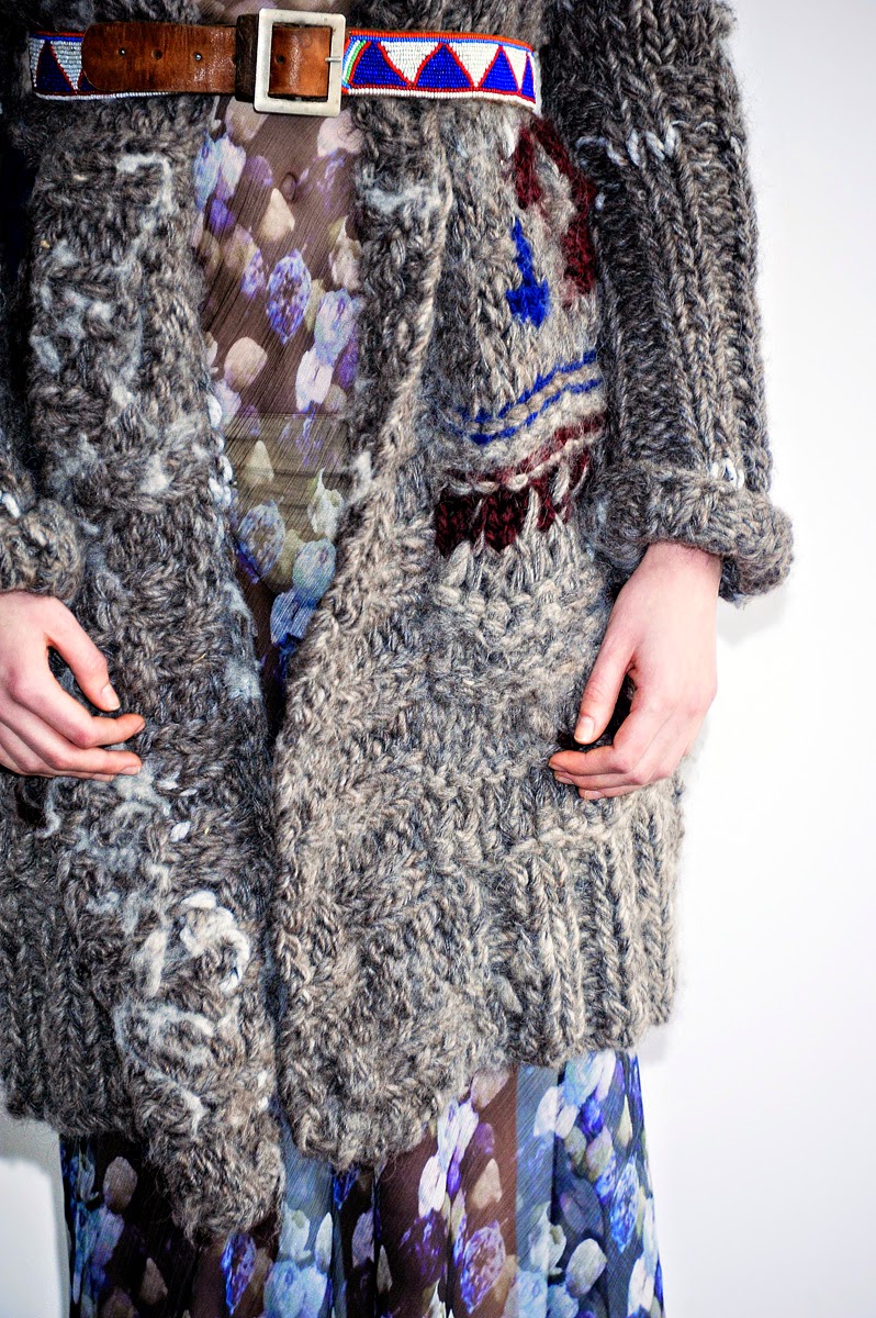
    Knitwear designer Amanda Henderson is doing some intriguing things.  I love the bulkiness and the random nature of what she does. Its as though this sweater coat grew, rather than was knitted consciously.  Its a great reference too, to the growing need we seem to have for things that overtly refer to the hand made, and the rusticated.  Of course, the styling addition of the Native American look belt contributes to that overall impression. And the juxtaposition of the hand painted looking chiffon in the dress with the lumpy bulk of the sweater coat speaks to our wildly diversifying culture.
    For as long as we have had the combination of Attire, Religion, Power, and Politics we have had folks like this fellow, togged out in the most sumptuous, and expensive of garments in order to, oddly, convince the populace that simplicity, poverty, and lack of vanity were laudable goals.  But as sure as there is a moon at night, gaining power means showing it, and showing it for a very long time meant such panoply.  his is the Archbishop of Treves, painted in 1509.  It shows his Eminence wearing two different, and doubtlessly wildly expensive silk brocades, extensively trimmed out with ermine, even on his mitre.  The faithful of the congregations under his controlling hand paid for all of this.  One wonders if he gave any thought to how fortunate he was, or to the difficult labors of those very people.
    I don't know why, in especial, that we equate flowers with femininity. Perhaps its because flowers are a potent visible symbol of life renewing itself.  But whatever the reason, we cannot escape it that flowers, and in particular pastel colored flowers, have a seemingly unshakable connection to the female, and to those who identify as such. This design is by Atelier Aimee Montenapoleone, and its pretty much every feminine trope for a ball dress you could want, all in one go.  Its strapless, body con through to the hipline, full skirted below, made of something floaty and filmy, possessed of a huge bow, albeit a soft one, and the pattern of the textile is a vast blurry floral that tends to the pastel range.  It presents a pretty traditional image of woman, and someone wearing it would need to project a good deal of assurance to not get overwhelmed by that.  And is it pretty?  Yup.
    I find it fascinating how concepts shuttle back and forth across the Attire language. In this case, the punk movement from the 80s has made its way, (again) all the way up to the couture realm from its place on the streets.  This is a detail of a Balmain design from 2011.  The intersection of safety pins and studs with the highest quality textiles takes a good deal of the clout out of this look.  So, from the 80s it cycled up to the top of the design world, then shifted back down to the streets, only to cycle back up to the couture 30 years later.  At this point though, punk is such an established look that it will get referred to often, like other periods and styles do, and like those other things, usually without understanding them.
    Ah, Mardi Gras in New Orleans, where insurance salesmen and bank tellers can dress up in outfits requiring triple digits of cubic space and squander outrageous amounts of not so disposable income.  Actually, snark aside, it love the idea of Mardi Gras.  I love the idea of occasionally giving ourselves entirely free rein to create our most wild sartorial fantasies, and thereby give ourselves a chance to inhabit another part of ourselves in a public way.  Bravo to Mardi Gras!  I hope it never ceases to give joy.
    And in another version of recreating ourselves, and forwarding a fantasy, Miss Dita Von Teese, who almost singlehandedly has re-imagined the art of burlesque, and brought it out of the shadows. Von Teese's carefully crafted, and perfectly presented fantasy of feminine beauty and allure is one that jumps over from teh 40s and 50s right into this century with an effortlessness that is breathtaking.  Dita von Teese is a monument of what level of fantasy a person can achieve if they have the wish to.  And in regards to the Attire language, she is a masterful speaker of it.  Learn the language and learn it well.
    Bringing up the rear today, something that only tangentially applies to Attire.  This is a hand mirror made the the Boucheron firm of Paris in 1867, designed by Armand-Desir Ruffault.  Its made of gold, and decorated with diamonds, rubies and pearls with complex and lavish enamel work covering nearly every inch of it.  As an expression of human vanity, its amazing.  And a fitting close to today's Scatter.

Have a grand Weekend!
I'll be here to chatter at you as often as I can over the next few weeks.