Wednesday, July 13, 2016

One Shot: Depret Ensemble With Dual Bodices-1867

    One of the many things I appreciate about the Metropolitan Museum of Art in New York is that they often will record numerous detail images of their objects so that a researcher can get as much information as possible.  This dress, which includes an afternoon bodice and an evening one, also has a matching bag which has managed to survive along with the dress itself.
    Very little is known of the designer, Mme Depret, who was working in Paris at 28 Rue de 4Septembre.  This ensemble comes from 1867, when the silhouette was beginning to change towards the emerging bustle shape.  The other thing that is different here is the manner in which the garment is presented for us.  Typically I try to show you things that are, (at very least) on a tailoring dummy.  This gown has not been photographed on a manakin or person, so we must content ourselves with seeing it laid out flat.  I mention this because the skirt would still have been quite wide around in 1867.  So engage your imagination to visualize the ovoid shape of the dress when worn.
    Made primarily of a ribbon striped silk satin brocade and a solid colored silk repp, the dress has all the elements that would become commonplace over the next decades. The most important of these is elaboration.  The sheer bulk of detail is amazing when crammed into one garment.
    From the front, it seems fairly restrained, but when viewed from the rear it becomes an explosion of overlapping decorative details.  The underskirt has a double sewn box pleat around its base.  In the center back the underskirt is parted and folded back to reveal a large gathering of the satin brocade.  This is further decorated with both an off-white double ruffle that is center sewn with a band of the silk repp, and headed with a doubled box pleats that are banded with the same off-white silk.
    Add to this the massive fall of claret colored fringed silk, and the looped silk cords with tassels.  
    Whew.
   
    Let's move on to the overskirt and bodice, shall we?  Or are you exhausted already?
    The overskirt of the dress is designed as an apron which gathers up on the sides. It is edged with the same style of center sewn pleating that decorates the opening in the rear of the skirt. at the center back, just at the waist is a bow in off-white. 
   
    The day bodice buttons on the front with carved mother of pearl buttons in the shape of flowers.  The material is the striped brocade, and the overall effect is quite simple since the bodice has little additional trim.  Only a very narrow, but dense ruffle of lace at the collar and cuffs, combined with a neckline bow of the claret colored silk finishes this day version of the bodice.
    The evening bodice is surprising in its relative simplicity.  It relies on cream colored net and lace, together with a shoulder-spanning band of satin that is held with bias bars at regular intervals to achieve its effect.

    And finally, the little shoulder bag has a strap of clear glass beads, which also edge the perimeter of the bag. It's trimmed with a fall of lace and a row of puffed satin gathers. Such a bag as this would have held  only a few small items.  It might have had the lady's handkerchief, her opera glasses, and possibly enough coin for a carriage if she was unaccompanied.
 
    What is not readily apparent to our 21st century eyes is that that huge mass of detail gathered towards the back was not just an opulent display of wealth.  It was also a profound sexual signal, focussing the attention on the rear, but in a subtle way that appealed to the over-rarified sensibilities of the Victorian mind.  They were not willing to come right out and say so, but the sight of a woman moving through a room with that volume of frivolous detail shifting about was rather like the plumage of a bird. Though the animal kingdom makes the males the showier of the genders.
    All in all, this is a remarkable save from a past era, and I thank the Met most heartily for keeping it safe for us all.


Tuesday, July 12, 2016

Otherworldly Voice: Yulma Nakazato

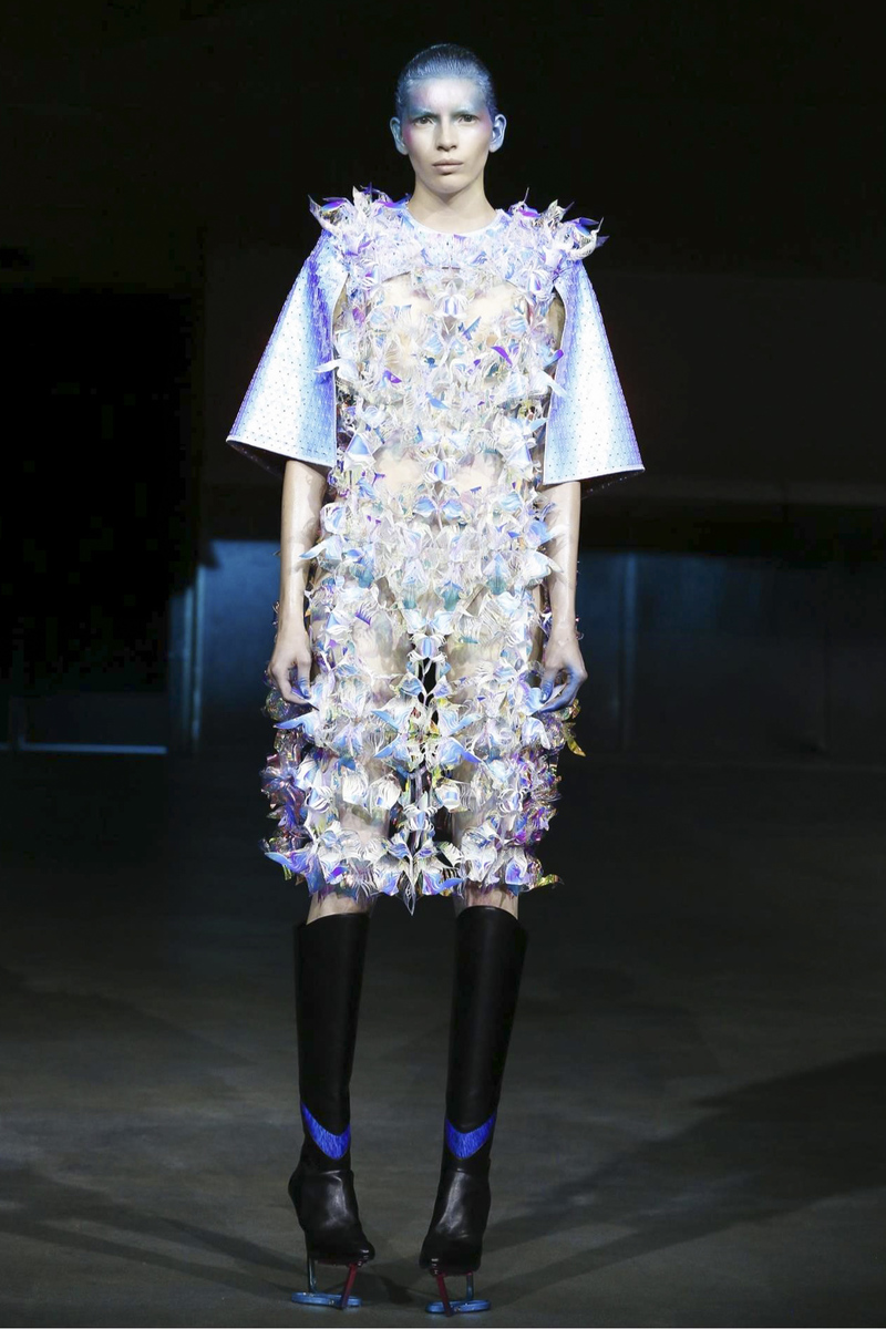
    Seeing these designs by Avant Garde artist Yulma Nakazato, I was instantly struck by how eerie and off planet they seemed.  It was as though we were getting a visitation from some alien species that we can only partly comprehend.  The proportions of the work are the most readily understood.  But from there it diverges into unknown, uncomfortable territory.
    Working exclusively with shiny metallic looking materials the garments all have a carapace-like look to them, as though the being is partly insectile.  And of course, created as these are only a few rock stars and really out there artists could even attempt these ensembles.  But the point here is to journey, to take a moment of time to look outside, in this case quite far outside our normal realm and consider. 
    What should we be considering?  All manner of things really.  What is the meaning of our personal roles within our culture?  What constitutes beauty?  Is beauty a true constant, or is there an aspect of it that retains fluidity?  What does our sexual identity mean?  How does it manifest in our personal use of the Attire language?
    Sure, looking at work of this sort can and does create eye twitches for most of us, sometimes even for me.  But it is the consistent willingness to challenge oneself that helps us to grow.  That is certainly no less true of the Attire language and what it can contribute to us as it is of anything else that is such an intrinsic part of our lives.  So, take a good long look and see what is to be seen, not just superficially, but the inner workings as well.  I think it can well repay the time.

Saturday, July 9, 2016

Scatter #109

    So it's once more into the dim and dusty recesses of my noodle.  This week's scatter has arrived for your delectation.  Onward!
    This detail image of an Alberta Ferretti dress got me thinking about layering of texture and the way that amps up what we perceive when we look at an Attire composition.  In this case, though we are seeing only two textiles in play, there are more textures than just the two, because of how they interact with each other, and with the body beneath. We have a lightweight silk, and a lace.  The silk has it's own texture, as does the lace. Combine them by layering and there is a third texture that seems to emerge.  In the case of the lace, when we see it laid over bare skin a fourth texture shows up, so even with these two elements alone, by skillful placement and usage the finished garment develops multiple shadings to it's meaning.
    This week is going to be kinda runway heavy, since a huge amount of what has been coming to me deals with the most recent couture collections.  Bobby Abbey Menswear.  I would like to get words off of clothing.  Clothes can speak quite well without the addition of text.  In the case of these three efforts the cartoons and the writing add exactly nothing to the finished work.  In fact, to my view they actually detract from the potential of each ensemble.  Edit those elements out in your mind and you'll see what I mean. All the pieces presented are interesting and potentially applicable in real world terms, (assuming a forward thinking gent, of course).  Introduce the imagery and the potency drops off, they become frivolous, rather than clothes to be taken with any seriousness.
    This is one of my favorite hat shapes from the 1950s.  It was essentially a vary broad headband that could be decorated in whatever taste you liked.  Hugging close to the head it provided a small scale but very effective frame for the face.  This particular one, from about 1954 is built of a fabric covered wire frame with wired red velvet leaves over its entire surface.  It's exactly the sort of hat that would have been considered correct for a cocktail party. And yes, it was acceptable practice for a woman to wear her hat while at a cocktail event, or while dining in a restaurant.
    The way urban apparel is changing for men is a continuing fascination.  We are coming out of a very long dark tunnel of bland that stretched for two centuries.  This ensemble is a great new way to think about how we express through dress.  It is simple in structure, easy to wear, and adaptable to myriad body types with ease.  The bold printed textiles make it dramatic, but it could be just as successful in quieter materials.  Also, the density of the fabrics in use could allow this kind of thing to play well in any season.  I approve!
    Along about the beginning of the 20th century this kind of undergear for women appeared.  It was called a combination, and it simplified dressing to a degree. By literally combining the bodice and pantalettes into a single piece it accomplished two admirable goals.  First was it made getting dressed a tiny bit quicker.  Secondly, and perhaps more importantly to the wearer, it meant that you would not be struggling with two garments shifting about with each other, nor would you have to feel the additional bulk at the waist, under your corset.  In a cultural sense it was also a further emergence, albeit a hidden one, of the great bid for freedom for women that was just beginning to build.
    Here's another runway bit.  Emporio Armani.  Armani has always been known for playing very quietly with menswear traditions, inserting only a few small details of difference, rather than going off in a fully new direction.  This has the result of making his work seem a lot more accessible than many other more adventurous designers. In the work here there are really only two details that makes these clothes at all notable, the exterior button fly of the trousers, and the ringed self belt.  Seen from the Attire perspective it is much more common that forward motion is achieved by these seemingly inconsequential bits.  So by taking these tiny baby steps we slowly move the Attire conversation along.
    This evening dress by an unattributed designer is from the 1930s. It's a splendid example of how differing textiles in combination can create both structure and motion, as well as visual drama.  The firm structure of the figured silk body is counterpointed by the sunray pleated expanse of the red silk chiffon that drapes with such fluidity that it seems motive.  The strong line of the red also causes our eye to move and gives that eye movement a real direction to take.  Rendered in other materials the same design could still work, but the final message would be very different.
    This is the Iron Crown of Lombardy. It is the oldest royal insignia known in Christendom having been made in the early Middle Ages.  Made of enameled and jeweled red gold it is a reliquary as well as a crown.  The circle of iron that connects the gold plaques from the interior is said to have been made from a nail from the True Cross. We invest immense power into the things we create for ourselves to wear.  This object, worn on the head would have conferred very high status to the wearer, especially to those who understood the meaning of the crown in its entirety.  But for those not so educated it would still have a strong, inescapable message about power.
    Ah the internet, how I love you, and how you madden me.  When I came across this image the accompanying text attributes this coat to the 1930s.  While I suppose that is possible, it seems unlikely.  The image on the coat is of an Art Nouveau styled woman, very likely a copy of a piece by Alphonse Mucha, who was hugely popular during that period.  Since there was no resurgence of interest in the Art Nouveau during the 1930s it seems probable that this is actually a scarf coat from around 1900 or so.  The only thing that points more towards the 30s is the type of tassel trimming, which was commonplace at that point.  Not enough, however, to accurately date this.
    Could I? Would I? Yes and yes, I could and would.  This is one of those shifts in menswear that seems to not only be gaining ground but spreading outwards.  The appearance of floral motifs in menswear has been steadily increasing over the past several years, and it's interesting to note that it is beginning to take firm hold in the ready to wear market.  Men seem far less threatened in their masculinity by such things than they used to be.  All to the good say I. What this also allows is a greater breadth of expressive possibility for men, who have been so sartorially hampered for so long. Dries van Notten S/S 2014 Menswear.
    Craig Green is one of the more notable Avant Garde designers around today, and this effort from his most recent collection is no less notable.  It's a challenge, even for me.  While I am fully on board with the brilliant, bold colors and patterns. I am perplexed about the two huge scarves. One hangs from the shoulder while the other wraps the waist. Perhaps they are intended to be only decorative. If so then I'm not sure that they fully succeed.  If they are meant to have purpose beyond that, I don't see what that purpose is.  The tied scarf around the waist does not appear to be doing anything other than
taking up space.  Lastly, this is from a Spring and Summer collection.  For Antarctica?  I'm so confused.

    As a final installment today this image which I found just this week.  This speaks of so many things to me.  First, in looking at that amazing quilted coat, I get references to gentleman's banyans of the 1700s and 1800s. There is a profound elegance to it, both from its colors and textures.  Then there is the model with his masses of ink and full beard, giving us the hipster thing.  But even more than that this feels to me like an expression of how deeply and profoundly our world culture is changing. Where in bygone days such a juxtaposition would have been thought at very least odd, now we can see the sophistication that underlies it, because of our greater access to the world both through travel and through all the various media we indulge in, including blogs like this one.  And of course I will admit that he is ravishingly handsome, which sure doesn't hurt.

I hope you've enjoyed this weeks grouping. Now go have some fun!
   

Wednesday, July 6, 2016

Watching The Metamorphosis

    One of the things of interest about examining a particular design house is being able to chronicle time and change through the work of it's ateliers.  In early 1858 Charles Frederick Worth began business with his then partner Gustave Bohbergh, and entered into the annals of the design community as the first couturier.  His career continued up to his death in 1895, though he ended partnership with Bohbergh in 1871.  The house continued under the stewardship of his two sons.
    So, today I want to take a look at the shifting of both silhouette, and the concomitant shift in social behaviors that went right along side them, by looking at a series of different evening and ball dresses all from the House of Worth.
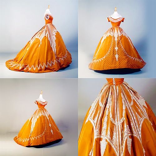
    First up, here is an evening dress from very early on in Worth's career.  Made in 1862, this evening dress is from the point when skirts had just about maxxed out with regard to circumference.  The decorative elements are almost all self fabric.  Which, honestly, was a hold over from the prior century.   And most well made clothing for women employed decorations that were primarily of the same material as the gown. It wouldn't be for another decade before the use of multiple textiles in a single ensemble was the norm, rather than the exception. Looking at this through the eye of time, even though this is a couture garment, it is relatively simple in it's design and construction.  The fully round skirt has some fairly simple applied decoration.  Not a patch on what is to come in just a few years, as time and technology bring their influence to bear.  What is of most interest is that till this point in time nearly all sewing was done by hand. Elias Howe's sewing machine was still a strange new device that most shied away from. So, even the most lavish of gowns has less elaboration than  we will soon see.
    Only three years later, these efforts emerge from Worth.  The absolute maximum of circumference has been achieved, beyond which technology fails.  The low, round bodice is nearly identical in silhouette, but the level of detail rendered on the skirt has increased enormously.  Additionally, we have at service the use of the new aniline dyes which make superior intense values of color possible.
   
    Rectitude, by the 1870s, became the most singular influence on design and apparel.  Social appropriateness and adherence to social rules becomes the single driving force for any kind of sartorial statements made.  Interestingly, it is at this time that the mass of the skirt collapses, falling first to the back as an ovoid shape, and then emerging as the first version of the bustle.  This begins happening in the latter 1860s, but by 1870 it is fully in place.
   
    As a method of stating one's position in society, nothing worked quite so effectively as making sure that one's clothing we as elaborated, and possessed of as many hand worked details as might be possible.  By the 1880s, where these four garments come from, it was all about making sure that the textiles and details of one's clothing announced in no uncertain terms where in the social hierarchy one stood.  The bustle had finally collapsed, but it left a train in its wake that permitted considerable display of unneeded, fabulously expensive fabric and decoration.
   
    By the later 1880s the bustle made a return appearance, since its ability to waste textiles and trimmings was nearly without peer.  By the 1880s, it was not only social standing that mattered, but sheer, undeniable wealth that held sway.  So, the ability to display, as we had in the latter 1700s, our means financial in overt ways, was of prime concern.  The greatest peers of the English realm fell by the dozens to the parvenues of the American rich.
   
    By the 1890s, this process of display and social acceptance or dismissal based on apparel was so entrenched that the clothing less overtly about display.  One had to know and understand an intricate set of unspoken rules and regulations in order to gain admittance to the highest realms of society, (though honestly why anyone would want to hang out with such venal, shortsighted folk is beyond me, regardless of their connections).
    At the end of the 1800s, and into the beginning of the 1900s, we saw a slimming, and a kind of simplification.  The shape no longer had endless layers of extraneous decoration.  It became a simpler, more direct approach, more in keeping with both the modern world's growing mechanization, and the increasing presence of women in the work force outside of the home.  Frankly, it is a simplification from which we have never fully retreated.  Though fussy clothes have always had their place, we have never been willing to go back to a world wherein women especially, were hampered in their movement to the degree they were in the 1800s.


    So, looking back over these decades we can see the slow, steady metamorphosis of not only how women dressed themselves, but how women thought of themselves. We can look at this timeline and see our progress; even when, living in the midst of it, we don't seem to be getting anywhere at all.

Monday, July 4, 2016

One Shot: Silver Brocaded Silk Robe a la Francaise 1750s

    I know that I have done a one shot post before about this type of garment.  It is a favorite period of mine, however.  And this example is just such an extraordinary one that I had to share it.
    The first thing that I see when I look at this is how perfect the proportions are in every respect.  The exterior shape, the silhouette of the gown is an idealized cone that takes the eye without effort right to the wearers face.  Where in other versions of the gown with panniers the line gets broken by the width of the skirts, this flows smoothly upward. Then, the material has been used in a way that maximizes the impact of the pattern, with the expert matching of the main elements of the design so that the visual harmony of the entire piece is undisturbed.  The placement of the silver lace decorations gives a kind of stately motion to the design, while also leading the eye up from the hem to the face.  Even the use of the textile and the manner of decoration employed in the stomacher works slyly to lift the eye up, first by concentrating our attention on the relative complexity of it, then ultimately releasing our view to the neck and head.
    Let's take a peek at that fabric, shall we?  Okay, so here we go.  It's a relatively simple appearing design for the time, but don't be fooled by distance.  Here is a close up of one of the floral motifs in the weave. There are four different types of brocade weave utilized in the creation of this silver work.  The ground weave appears to be a simple plain weave, so all the attention goes to the brocaded elements.  As well, that yellow, and other similar shades, were colors that held their popularity for a surprisingly long time considering how often tastes changed.  I have seen examples of panniered gowns covering four decades that all rely on variants of this same sunny color.
    The undulating application on the overskirt that continues up the side of the gown's front are pretty much a textbook style.  It was one of the most often used methods of trimming out a large area of a dress of this sort.
    The huge expanse of silver netted lace that covers the lower half of the underskirt is also a common element.  Frequently a wide self ruffle, or a band of lace would be used in this position on the underskirt. It had an additional advantage, while having great visual impact, it took little time to apply.
    The sleeves of the gown are essentially what we would today call raglan, with the armseye of the sleeve both very high and pulled far to the back. This cutting technique served to help keep the wearers shoulders back and chest high, maintaining that signature erect dignity we have come to think of as normal for the period.  Frankly you had no choice but to stand up straight, your clothes allowed nothing else.  The three tiered sleeve cuffs were a design element that held sway for decades. So popular were they that they were almost a requirement.  And they were nearly always cut in shallow scallops, as you see here, then trimmed on their edge with fly braid, guimpe or ribbons.
    As a side note, the white ruffles at the neckline and cuffs are reproductions, but they accurately show how the the gown would have looked when worn.
   
And then at last there is the stomacher.  The decoration of the stomacher is not very complex, which is a good thing, considering the mass of silver fly braid and lace that trims out the edges of each of the structured bows, and runs down the center point.  And everything about the manner of its decoration adds to the gravitas of the whole. This was not meant to be a playful garment, but one for serious occasions.  Were this meant for daytime, or more casual pursuits the decoration of the stomacher would have been more playful, the bows less rigid.
    So to sum up, this garment is a sublime example of the period and style.  It is not only beautifully constructed and decorated but is harmonious in every part of its design.  Whoever was lucky enough to have owned this was a woman of great taste and restraint.  It must have felt marvelous to be seen in this amidst the candlelight of an evening gathering.