Wednesday, March 16, 2016

Spencer, A Lost Word

    Though the Spencer style jacket began as a military garment, a waist length, double breasted coat. It was named for the 2nd Earl Spencer, George, who supposedly had a coat altered after its tails burned somewhat in the coals from a fire.  It became a hugely popular ladies fashion that held sway for about 20 years. 
    In definition the Spencer as it came to be known for women was a jacket that ended right under the bust, having full length sleeves, and a shape that exactly copied the shape of the dress beneath.  As such it was fashionable for only a short period, then its definition changed, and now Spencer is a term used for any sort of short jacket or coat.  The Spencer as it was known from 1800 to 1820 has vanished entirely, it's meaning and function altered.  In this way it is exactly like the metamorphosis of a spoken language word that can change definition, and usage over time.

    During it's short primacy it had endless variations from dead plain, to lavishly decorated.  As a practical garment it had little real value, since it covered so little of the body.  But part of what it did do was allow a lady to be suitably attired for town with minimum additional clothing.  She could grab her Spencer and hat, and be ready to go, where other options required greater time and effort.
    There was another thing that made the Spencer an attractive accessory item. It was small enough that it could be made up at home quite easily, and required little material to create. Also, it was a perfect small canvas onto which a skilled woman could display her sewing artistry.  It's size also meant a woman could use up small bits of things she had about, to embellish it.
    Here are a few examples of this altered Attire word.  It was charming, illogical, (as so many garments are), but in it's day, indispensable.


Saturday, March 5, 2016

Scatter #94

    I'm heading up to Oregon with my partner tomorrow for a week of fun, and visits with family.  I will be doing my best to stay on top of things here and on facebook, but a couple of places we will be will have, shall we say, spotty internet coverage. So things may be more broadly spaced than usual. 

Okay so that's out of the way.  Let's dive into this week's Scatter, shall we?
    These are one of the more bizarre footwear fashions ever created.  These wooden bridal shoes are unique to a particular region of France, close to the Spanish border, called Ariege, south of Saint Girons.  They originated in the 9th century when Moorish invaders raided a French village and kidnapped some women. The villagers retaliated by attacking the Moorish camp, and killing the invaders by stabbing them through the hearts with the points of their clogs.  The practice of making these shoes continued, morphing over time to become a wedding gift by the groom to his bride.  The height of the point was to indicate the greatness of his love for her.  Man, are we human's strange, or what?  Who doesn't like a bit of "blood of thine enemies" to spice up a wedding?
   
    Another nudge at the menswear traditions. Another little shove, really.  These images are of Frankie Morello suits from 2013.  The digitally printed material of the suit drags it into surreal territory, and also makes the silhouette less body revealing, since it is so visually confusing.  While I champions any thing that creates new ways of configuring men's apparel, this sort of suit is unlikely to ever really catch on.  Just the jacket?  Sure. Just the pants? Sure. Together it's really too much of the same pattern.
    Mask? Wearable art? Make up? All of the above?  This is strangely compelling to me.  The way the applied decoration both reveals the contours of the model's face, while also acting as an obstruction to our truly seeing her is what creates that odd pull/push response.  Like a veil on a hat or a hood concealing part of the head, we want to get past it.  Perhaps it's just our inexhaustible curiosity that is in play.
    After the revolutions in the North America and in France, clothing for both sexes changed immensely.  But even though menswear simplified and lost nearly all its decorative detailing, there were both holdovers from the old, and experiments with new styles, that didn't survive.  This is a great example of one of those experiments.  This coronation suit was made in 1814 or 15 for King William I of the Netherlands.  It takes elements of the Ancien Regime, mixes it with 19th century ideas, and throws in a few other elements.  The breeches and coat sleeves are right out of the 18th century idea book. The coat is surprisingly loose in its cut.  The shoulder detail is almost, but not quite, Tudor period. Since this was for a coronation, and the clothes were often a step or two outside of regular formal wear, it's not a big surprise.  What I find interesting is how contemporary the cut of the coat is, (minus the shoulder detail).  I have found no portrait of William I wearing this suit.  The official coronation portrait has him in very sober military garb.
   
    As an accessory, gloves have risen and fallen. These days, apart from gloves to simply keep the hands warm in winter, they are largely not worn, outside of costume events. That said there is something wonderfully expressive about them, especially when they are decorated in some way.  These two pairs of gloves were runway accessories at a Delpozo show this year.  There is something poetic about these.  I approve. I'm sure the people at Delpozo are relieved to know it. (grin)
    A$AP Rocky is one of the more significant Rap artists to come along in a while, and a good part of his appeal is his willingness to push forward a new manner of appearing, that steps away from the now tired tropes of too big pants, and backwards ball caps.  This image is from a Vanity Fair article and photoshoot that in part chronicled his collaboration with Guess Originals.  The garments here are loosely fitting, sexy and possessed of a real elegance.  It's an interesting new angle on dressing men.  I could imagine clothing along these lines moving into mainstream wear. Their ease and comfort would be big selling points.

    This is the Infanta Isabella of Spain, who became Queen of Spain for a fairly short and tumultuous reign, only to abdicate, and spend the rest of her days in exile in France. Her dress is of the 1860s, at the point of the crinoline's greatest dimensions.  Her gown possesses a rather heroically long court train, which she has draped over her arm, (a surprisingly casual addition considering its a royal portrait).  Even without the train this would be a garment for a person of vast wealth.  The inclusion of so many dozens of yards of hand made lace alone would attest to that.  This is in many ways a classic example of the middle road of style during that time. The dress is actually quite conservative in its design. No garish colors, no bold decorations.  The bodice is modestly high in front, and dips to the sides to show the shoulders.
    This, on the other hand is Tsar Ferdinand of Bulgaria, who is not trying to be conservative. He is making sure that there is no doubt at all about who is the boss. Not only is his uniform jacket overburdened with huge froggings and cording trim, he is laden with so many medals, orders, badges, sashes, and chains of office that it's hard to see his uniform at all. It's more than just a visual display of power, its a shout for attention.  Bulgaria was never at any time a major force in Europe, but the Tsar was sure going to make you think so.  Or perhaps, as is the case for so many of us, he was trying  to convince himself of that, even more than whoever saw him.
    Most of you, (me included) will take one look at this and say "Queen Amidala!" Certainly headdresses like this one were the source point for that now iconic film costume. This is a woman's headdress from Mongolia, from the 1800s. The brass is decorated with carnelian and turquoise beads, with black glass stones, yak hair and silk cord.  Like so many Attire concepts, this one is meant primarily to convey wealth, and station.  The wearer was a woman who had married a man of considerable power and means, and she was expected to display that connection.  It is fortunate for her that she would have been relieved of most kinds of labor, since this is doubtlessly heavy and uncomfortable.
    This 18th century chainmail armor was worn by Sultan Mustafa III of the Ottoman Empire.  The mail is decorated with gold plates, and gold mail.  The plates are decorated with jewels as well. It is an example of parade armor from another culture.  Even though plate armor as was common in Europe was well known, it was not in use, mostly because it was simply too hot.  Plus the increased mobility afforded by mail armor served well to offset the lessened protection. And I just gotta say, It's kinda sexy looking. (grin)
    Alexander McQueen, Fall/Winter 2014-15.  For me this is a wonderful meditation on the ability of texture to powerfully affect how we see something, and what we feel about it.  Devoid of this lush feathery mass the shape of this garment might only seem odd.  Adding this texture that practically begs to be stroked to it makes this into something poetic, and somewhat eerie.  It also takes into that realm of transformation I speak about so often. This model is no longer entirely human, but some hybrid of person and bird.
    Cultural imperialism made solid, as in solid gold.  La Corona de Nuestra Señora de la Asunción de Popayán, also known as the Crown of the Andes.  It was made for a larger than life-size statue of the Virgin in the Cathedral of Popayán, Colombia. It was created at least in part in the 16th century. The emeralds that adorn it are supposed to have been seized from the captured Inca Emperor, Atahualpa, who lived from 1497 to 1533.  It is undeniably beautiful in a barbaric way, and a masterful piece of the jeweler's art.  It is also a monument to the eventual subsumption of indigenous cultures to invading peoples.

Well, that rounds out this week's dozen, so get thee up, get thee out, and enjoy thyself!

Wednesday, March 2, 2016

Pillars

    Like any other language, Attire has basic concepts that, once expanded upon, form most of the words and phrases that exist within its boundaries.  For Attire, these are concepts that relate to structure, mostly.  For example, skirt is a concept as old as we are, and as intrinsic to Attire as anything else might be.
   To the skirt notion I would add cloak, robe, and belt.  Whereas dress is a concept that comes out of the greater idea, robe, and as such, does not belong in the first listing of essential forms.
    When I speak of essential forms, I mean those proto-Attire ideas that are the beginning point for what we now know and wear, and for all the things that have existed between.  They are ideas so primal that they can exist in both draped, and tailored forms with equal ease.
    Before we knew about cutting and sewing cloth, we took pieces we had woven, or hides from animals, and wrapped them about our lower bodies.  Voila, the skirt is born.  And the wrapped skirt is still made, and worn every day, all over the world.  From that first cause all other skirts of every variation have their ancestry.  The tiniest micro mini, the grandest ball gown skirt, the slinkiest bias cut bandage, the kilt, the sari, and the tutu all come from the baseline idea of covering the lower half of the body, and especially the loins, in a manner that does not separate the legs from one another.
    The cloak is the second primary cause entry, since along with the skirt it was an idea so blazingly obvious that it had to have occurred right away.  Take an animal skin and pull it up around your shoulders.  Boom, the cloak comes into being.  Every cape, shawl, scarf and throw comes from this initial thought.
    The other one, though I class it as a primary, must have come a moment or two later in time, since it requires configuring materials in a way that separates the appendages of the body, rather than simply covering them.  This is the robe.  Like its cohabitators on the front lines of Attire, skirt and cloak, robes can be made in both draped, or cut and sewn methods.  And like these other ideas, they are still made, and worn in both ways, even now.
    The robe, being a garment that overs the lower body in an unbifurcated way, and the upper body in a way that separates the arms and the head, with openings, is the precursor to the coat and jacket, the dress, and to the shirt.  Since a jacket is just a coat with no lower part, it is a child of the earlier idea, coat.  The shirt in its turn is the offspring of the dress.  But all four apparel ideas spring from the robe first.  And each of the endless parade of variations on these ideas have had their birth in this simple conception.
 
     The last of the ideas that I consider to be so early in its visualization is the sash. In order to hold that first skirt up, we needed something.  A length of vine would do the trick if nothing else was to hand, and very likely did exactly that service in our dimly viewed past.  Those first robes needed to be held closed somehow, and a piece of narrowly woven material, or a strip of leather, served that purpose admirably.  Expanding on the idea we get everything from the cummerbund, to the obi, and even to the corset.
   
    These four alpha ideas form the perimeters of Attire, with all the untellable millions of innovations that make up the actual vocabulary, contained within their limits.  So when you next get dressed, take a moment to consider that your hoodie with the cartoon characters on it came from a very long lineage that stretches back to its source point, the robe.  When you cinch up your belt, remind yourself how old the idea itself really is.  When you slip into your skirt, imagine your forebears of thousands of years past doing the very same thing. When you wrap that scarf around you before going out into the cold, think on how it's be just the same action, in just the same way, since the very beginning of Attire.


Tuesday, March 1, 2016

The Fall and Rise of Pink

    For centuries it was of no matter whatever that a man had clothing that was pink.  Not only was their no social interdiction connected to it, pink is a color readily achievable through many different sources, so it was a commonplace hue.  Men who lived at all stations could, and did have clothing that was shaded to the pink, especially considering that most natural dye materials result in more muted tones than we can create now.
    But something happened.
    Somehow, through a combination of different social changes it became connected with being dissipated, probably amoral, and effete.  What were these changes?  How did they end up pulling the pink right off the backs of men all over the western world?

     The first major effect was revolution.  Both the American revolution and the French revolution created a societal disapproval of anything that overtly trumpeted wealth.  Clothing for men and women became considerably more sober looking, as a result.  No one wanted to be accused of being frivolously extravagant.  A contributor to this more restrained apparel was the rise of interest in all things classical.  Though we weren't willing to go so far as to put men into togas and khitons, we pared things down as much as we could.
    The second major force was the Industrial revolution.  More and more men were leaving agrarian work and taking up business trades in the cities of Europe and America.  In order to be perceived as serious, clothing that eschewed the flamboyant became the rule of the day. And since pink was at that time considered to be a color that implied energy and happiness it was too lighthearted for the new solemnity.
    The third, and perhaps most pervasive of the influences that pushed pink out of sight for men, was the rise of Victorian morality, which restricted everyone to extremely narrow pathways of behavior, and appearance.  Certainly anything that smacked of being less than upstanding would cause raised eyebrows.  So pink as a color option for men evaporated utterly, becoming the exclusive province of women.  And so it held for a very long time indeed.
    The only places where pink survived was the occasional pale pink broadcloth shirt popular in the American Northeast, and by the 1950s, possibly a sport shirt.
    It has taken nearly 200 years for pink as an acceptable color choice for men to reenter the lexicon of Attire options.  And even now there remain strong feelings about pink. Many men would not wear it, for fear of the associations it still has.  And all this fretting and fuss was over something that was an entirely artificial construct, based of a series of outward social changes that had nothing whatever to do with who men actually were, and are.
 
    
Fortunately we have entered a time when the exploration of human sexuality, and the willingness to discuss it, and  from that embrace more variation, is defusing the charge that remains on pink.  Looked at from the outside it seems so manifestly silly that we would attach so much power to a color that it could substantively damage a man's life should he wear it.  But for a long time it was exactly so.  A man wearing pink in public was marked as suspect.  And if anything else about his behavior seemed untoward, then he could be socially censured in major ways.  It was done quietly, and never spoken directly, but it most surely was done.
   

Saturday, February 27, 2016

Scatter #93

    Good morning and Happy Saturday, it's time for everybody's favorite activity; guessing what random stuff falls out of Paul's brain.  It's been a wacky week, so let's just see if that reflects itself in the scatter choices, shall we?
    I'll start you off with something easy.  This is a fashion shot from 1958.  The two coats are emblematic of two differing, but very popular shapes for the time; the reed slim columnar line, and the coat with significant back volume that arcs out from the body.  Both coats exemplify a time when the choice of outerwear was far more significant than it is now.  Dressing for town was a much bigger deal, requiring closer attention to detail.  It was socially required to put your best self forward when you were on the city streets, so considering what coat to purchase was a major question.  For most women, this meant not only finding a style and color they liked, but taking into account the sort of clothing it would be worn with.  The idea that we had to look fully pulled together when we walked the city was about two things, to my mind, one was simply about being socially acceptable, about fitting in.  The other was a subtle nod of respect, not only for those who were seeing you, but for yourself.
    A few days ago on the facebook version of Attire's Mind I posted a pair of white satin breeches from the early 1800s.  Here is an example of the last time that breeches had any serious use in the Attire language.  These are what was referred to as Plus Fours, which were very popular in the 1920s for outdoor sport, particularly activities like hunting, fishing, and golf.  They were normally worn with over the knee socks, and sturdy brogues.  The amount of volume in the leg allowed ease of movement, and the removal of volume from the lower leg made moving through wooded areas easier.  They remained in use only for a decade or so.  By the mid 1930s, they had been relegated to silly old fogey status, and slipped out of use entirely by the 1940s.  There have been a few attempts since to bring them back to use, always without success.
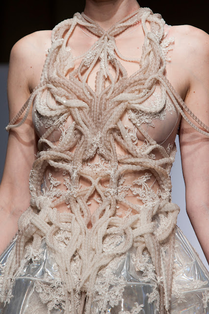
    Beautiful and disturbing.  It's amazing how dense the level of reaction to something like this can be. For me, my response to this covers many things.  First, the interplay of luxe embroidery work and modern materials, like the transparent plastic of the skirt creates a nice tension that I find appealing.  The twining lengths of beads, encased as they are in sheer fabric tubes take on an organic feel that is slightly unsettling to look at, mostly because of the color. It looks like viscera.  Associated with that, the organic look to those twisting forms implies that they might be snaking over the body of their own accord, which is an uneasy thought of its own.  For all that, it remains a beautiful object.  Imagining it in another color, it would take on entirely different meanings, but still be lovely.
    A trope that keeps surfacing in design is that of deliberate bedragglement.  In these often confused and difficult times, gestures like these take on a much darker subtextual meaning.  They remind us of poverty, homelessness, mental illness, and societal conflict, so they are uncomfortable for us to look at with dispassion.  Of course the other aspect that makes us squirm a bit is that clothes like this are fabulously expensive garments, made to be worn by people who have no contact with any of the uncomfortable things I mentioned.  So they are also a visual slap in the face, as well as a statement of blithe unconcern.  That they can at the same time be meant as a social satire is part of why the Attire language is so fertile, complex, and expressive.
    This gaudy object is the crown of Empress Eugenie who was the spouse consort of Napoleon III of France. during the mid 1800s. Designed by Alexandre-Gabriel Lemminier in 1855 it bears eight gold eagles with wings aloft.  The decorations include 56 square, and round cut emeralds, and nearly 2500 diamonds.  The court of Napoleon III was known for the extremity of it's lavishness, and for a certain florid taste.  This crown is a perfect example of the "over the top-ness" of the court.  It is almost as if, by pushing so hard with display they were trying to convince not only others, but themselves about their power and importance.
    This is a detail image of a Louis Vuitton design from several years ago.  What made it appeal to me is the ferocious intensity of the colors in use, and how they affect emotion and opinion.  Orange is a difficult color for most to pull off since one of our gut level responses to it is uneasiness.  Pairing it in equal distribution over the pattern with that orchid violet, and with black changes the messages possible.  Our associations with purple pertain to royalty, and also to intellect.  Black is a color associated with mystery, and danger.  Put these three colors together and suddenly there are complex stories that can be told, myriad emotional states.  How we interpret the colors in the fabric depends largely on the rest of the sartorial words that get used.  Carrying this bag, for example lightens what might be a dark message, because of the bright flowers that look as though they were lifted from some east European ethnic costume.
    We really cannot stop ourselves.  We keep coming back to this.  We seem to have a segment within us that can't stop trying to refashion ourselves into something fantastical, magical, or surreal.  Perhaps it is simply our unbounded creativity and curiosity.  Certainly in this particular costume there is a strong aspect of sexuality, both in the choice of fantasy creature, and the way it's realized.  We never stray too far from our primal selves, no matter what we may think. It lives within us all, just waiting for it's moment to come out and play.  For some of us this is an aspect we embrace, for others, something fiercely denied.
    This object is part of the collection of the Victoria and Albert Museum in London. This corset is from one of the final points before they changed shape to encase the hips to a degree.  Prior to the drop to the hip line corsets finished right at the waist point.  This one is from the 1860s. It is covered with bright royal blue silk moire', also known as watered silk, and trimmed with hand made Broderie Anglaise.  Another thing of note is that after this point the corset rose in front creating the mono-bosomed effect that typified the remainder of the century.  This was the last time that a woman's breasts we separate from each other visually till after the beginning of the 1900s.  Scholars have equated this merging to the general lack of willingness on the part of Victorian culture to mention anything whatever having any connection with sexuality or procreation.
    Like any art, applied or fine, it is part of the purpose of it to occasionally disrupt our composure.  This image is from a 1998 Alexander McQueen collection. The aluminum lower jaw jewelry is a deliberate act to get us to ponder what exists beneath.  It is also in profound contrast to the clean lines and exquisite nature of the model's suit, and his grooming.  The mouthpiece is rough, and looks like it might even have been cast from a real jaw, which only intensifies the effect on us.  Though such things are unlikely to become used words in the Attire language, it is vital that they exist, even for a small moment of time to make us think a bit, and keep us a trifle off balance.
    It is often the case for me that it is a detail on something that captures my eye and won't let me look away.  In this instance it is those silk roses.  Each one is crafted by hand, petal by petal, and the finished product is so realistic you could easily imagine dew on them, or a bee being convinced of their truth.  The hat is from the famous Paris milliner Mme Virot who was so successful, and so skilled she could maintain a shop on the Rue de la Paix, still one of Paris' premiere high end locations for retail.  Made in 1902, this beautiful silk and linen summer hat is perfectly proportioned, and expertly trimmed.  It's in the collection of the Metropolitan Museum of New York.
    Even I, sometimes am left scratching my head in confusion.  As a concept, the interplay of fluid and rigid, translucent and opaque, I completely understand.  There is even an aspect of surrealism in the way the front of the jacket works with the applied front that looks like a biker jacket.  I get that.  Another point where I have concerns is that the jacket, with it's fur collar and metallic brocade is all about extravagance.  The lace skirt looks like it was made from very low end goods, or at least they were not worked up in a way to enhance them.  Where my confusion comes from is that these disparate elements contain no point of harmony.  There is no single thing that makes these all relate to one another, so it becomes a visual gibberish that will not allow us to parse it out.
    As a final entry today something that just made me smile really big.  Manish Arora is one of the many designers who are sending men down womenswear runway presentations, and vice versa.  This men's ensemble walked the runway for his S/S 2016 collection.  There is not a single thing here that I don't totally love.  Each piece contributes equally to the finished visual statement.  And being the color whore that I am, this makes me very happy indeed.

No go on out there and have some fun!