It's not very often that I post something that doesn't quite get all the way to it's intended point. I would rather focus on the positive, and so successes are more my thing, than not. That said, I do have to acknowledge that there are things to be seen, and learned from looking at the lesser efforts, the things that miss the target.
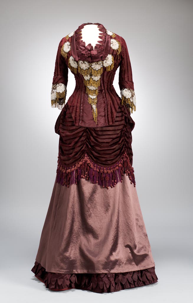
This dinner dress is from 1875. It's a great example of something that could have been great, but through some unfortunate design decisions, isn't great at all. What has to be said before parsing out what went wrong is that in terms of construction, there isn't anything to fault this. Whether it was sewn by the lady who wore it, or it was made for her by a professional dressmaker, the skill set on view is just fine.
Now, on to discussing the garment in detail.
Let's begin with the textile choices. There are three in use here, two solid color silks, and one silk with velvet stripes. Superficially these are fine choices for each other, it's the placement of each that goes off track. In especial the lighter colored silk that comprises the over skirt is used nowhere else on the gown, so it doesn't feel integrated into the whole design. Also, the weight of the material is such that it doesn't quite balance the visual gravity of the rest of the costume.
The second design issue is the asymmetrical draping of the swagged apron/bustle. Viewed from an angle, it doesn't appear odd, but seen straight on it looks like it has slid askew, though it's clearly intended to be off center. Two things could help this. One is setting one of the pulled up points directly on a major seam line in the bodice. The other is a slight increase in the draped volume.
The third issue is that of the ready made beaded appliques laden on the bodice. Nothing has been done to really make them seem an intended part of the design. They appear simply slapped on with little consideration for placement or volume. The fact that they are obviously store bought pieces that have been attached is enough reason for concern about the choices made. There are ways to make such pieces look fully a part of the garment. For example, a small decorative ribbon heading at the top of each one would work to draw them more fully into the design. Also, using a few less on the bodice, but taking two three and using them to mark the irregularity of the bustle draping would help.
The most important point here, is not about the garment itself and its rather clumsy finished appearance, but what it communicates to us, ultimately about the person who wore it. Not all of us have perfected taste, or an unfailing design eye. So though this dress is one that was clearly well intentioned, the lady who wore it was probably proud of it, and was just as probably blind to its deficiencies. It remains for us, as viewers, to understand and forgive, just as we forgive the lapses of our loved ones.
Often, in looking at these pieces from our past, it is the things that go wrong that humanize them. They remind us that these were not people from a story, but folk just like us with lives, foibles, and dreams.
Thursday, April 21, 2016
Tuesday, April 19, 2016
That Is So You
How many times have we either said this, or had it said to us? I'm sure none of us could track the amount. But the reality of Attire as a language we utilize daily, is profound. So much has it become an intrinsic part of our lives, that we have merged it's concepts with our spoken language. We give literal voice to it when we say things of this nature.
How odd and wonderful it is that, merely looking at a garment on a hanger, or gazing at some accessory, will make us think of a particular person. We come to associate certain types of Attire words with certain people, because we have seen them in something similar. We know it's a word that they could employ. We understand that such and such a pair of shoes is one they would like, so the object becomes connected in our heads, to the being, the personality.
The ways we make this connection are as varied as the humans we connect to. It could simply be a favored color. It might be a particular brand of item. It could be a type of pattern, a kind of detail, or a certain texture. It could even be a specific manner of fitting. Most often of course, it is some combination of these things that sets us to thinking that some friend or family member would wear what we are seeing. We can visualize them clearly, the connection is so strong.
It's obvious, that it's a part of our extraordinary pattern recognition, and associative skills. In order for humans to survive in a dangerous world back in the earliest days we had to develop multiple methods of recognizing what we were seeing that enabled us to react to danger more rapidly, since we did not evolve other protections. This "that is so you" thing, is a manifestation of the same survival technique, applied in a different manner.
By using our unique talents for associating seemingly disparate things, we are able to categorize, and recognize things that allow us to support the people we consider to be essential tribe members. In seeing things around us that we realize connect with those we care about, we are building a stronger connection to them, almost literally weaving the structure of our society.
So, when we say, "that is so you" to someone, we are really saying that we understand the visual messages that they communicate to us through the Attire language. We are saying that whatever it is that they are relaying to the world around them, we comprehend not only the surface of it, but the deeper contexts. We grok them. We truly get who, and what they are. And that sort of level of understanding is only going to result in greater closeness. It may not result in deep friendship, or love, but fear and apprehension fade away to nothing. When we understand this about someone, we have a key to understanding something primal about them. We have a primer, if you will, about their real nature.
When it comes to getting on in the world, coming to a place where we can understand even some part of the people we face is essential. And in this confusing, divided, and contentious world, we need that more than ever before. So, knowing that, when you see something in a shop, or even on someone you pass on the street, and it makes you think of someone you know, because you know they'd appreciate it, remember this; we are drawn closer together by such seemingly insignificant things as these. They make us more a family each time they happen. And we all need family of one kind or another, we need it.
How odd and wonderful it is that, merely looking at a garment on a hanger, or gazing at some accessory, will make us think of a particular person. We come to associate certain types of Attire words with certain people, because we have seen them in something similar. We know it's a word that they could employ. We understand that such and such a pair of shoes is one they would like, so the object becomes connected in our heads, to the being, the personality.
The ways we make this connection are as varied as the humans we connect to. It could simply be a favored color. It might be a particular brand of item. It could be a type of pattern, a kind of detail, or a certain texture. It could even be a specific manner of fitting. Most often of course, it is some combination of these things that sets us to thinking that some friend or family member would wear what we are seeing. We can visualize them clearly, the connection is so strong.
It's obvious, that it's a part of our extraordinary pattern recognition, and associative skills. In order for humans to survive in a dangerous world back in the earliest days we had to develop multiple methods of recognizing what we were seeing that enabled us to react to danger more rapidly, since we did not evolve other protections. This "that is so you" thing, is a manifestation of the same survival technique, applied in a different manner.
By using our unique talents for associating seemingly disparate things, we are able to categorize, and recognize things that allow us to support the people we consider to be essential tribe members. In seeing things around us that we realize connect with those we care about, we are building a stronger connection to them, almost literally weaving the structure of our society.
So, when we say, "that is so you" to someone, we are really saying that we understand the visual messages that they communicate to us through the Attire language. We are saying that whatever it is that they are relaying to the world around them, we comprehend not only the surface of it, but the deeper contexts. We grok them. We truly get who, and what they are. And that sort of level of understanding is only going to result in greater closeness. It may not result in deep friendship, or love, but fear and apprehension fade away to nothing. When we understand this about someone, we have a key to understanding something primal about them. We have a primer, if you will, about their real nature.
When it comes to getting on in the world, coming to a place where we can understand even some part of the people we face is essential. And in this confusing, divided, and contentious world, we need that more than ever before. So, knowing that, when you see something in a shop, or even on someone you pass on the street, and it makes you think of someone you know, because you know they'd appreciate it, remember this; we are drawn closer together by such seemingly insignificant things as these. They make us more a family each time they happen. And we all need family of one kind or another, we need it.
Saturday, April 16, 2016
Scatter #99
Welcome to my brain pan. It's an oft times confused place, full of oddments and ephemera, but it's all I've got to work with. This week's Scatter is about to begin, so get ready to dive in and muck about among all the random stuff in my pointy little head.
This image is from the most recent Valentino runway collection. What interests me here is the interaction between the fragility of the lace that forms the base of this garment, and the stiff leather panels attached to it. It becomes a sort of exploded view of plate armor. In fact, I'm pretty sure that is the intent. I also like that it plays with the sheer trend in an entirely non-sexual way. Though the look is undeniably sexy in a tough customer kind of way, it is in no way sleazy, or vulgar. I suppose my only quibble would be the comfort level of wearing an item composed of such clearly rigid leather pieces.
I have no idea whether this model is actually tattooed in this fashion, or whether it was created for the shoot. It certainly is a high impact kind of ink. And if real, it is a very loud statement about the person's feelings and opinions. Such extreme ink is not for the shy. And I love the profound juxtaposition of the model's romantic pose, elegant suit, and placement amongst flowers. part of what gives this even more potency is the fact that everything has been done to make us focus somewhere else, other than the tattooing, so that when we do note it, it is more startling. It also makes me think of the extremity that some of us have been called to to make ourselves feel seen and heard in our remarkable world. Such literally in your face tattooing, and of such a disturbing nature becomes not only a personal expression, but also a meditation on human frailty, and human folly.
Speaking of tattoos, here's an image from 1905 of a woman with extensive ink. It certainly was unusual for women in western culture to be tattooed, but it did happen. What it would have meant for a woman to be so adorned was significant. She would have been excluded from polite society, even if she managed to keep them all hidden all the time. Knowledge of their very existence would have called her social suitability into serious question. Such social opprobrium is hard for us to understand now, since tattooing has become so socially acceptable, but a century back it would have been a serious hindrance for any woman, and for a good many men, as well.
Ah the 1980s. I remember it well. One of the things that epitomized the decade was a sense of loose structure. The cut of pants had loosened up, shirts and jackets had gained volume, and lost a good deal of rigidity. For women there was a range of over-scaled, loosely fitted clothes of all sorts. This was in direct counterpoint to the other popular look of skin tight everything. Super tight jeans, knit tops, spandex leggings for men and women were a common sight. But for most people it was this easier, more comfortable look that was the go to of the day. I know I had lots of loose fit pants, and blousey shirts a couple of unstructured jackets, and even one of those leather neckerchief thingies like the model is wearing. (In truth I still have it).
By the 1920s, when this dress was created, Paul Poiret had ceased to be an innovator in the design community, and his couture house was struggling to survive in a changing world. That said, this is utterly delicious looking. From the intense purple, to the choice and placement of the beadwork this is a great piece. It's also in indicator of how things were shifting. By 1928, when this was done, hemlines were falling, and the beginnings of that softer, more body hugging look that would dominate the entire 1930s. The way it began was the appearance of floating, bias panels like those decorating the skirt. So this dress is a transitional piece. It still has the tubular chemise shape, but the hem as dropped and the square chiffon pieces refer to what is yet to come.
Here's a gentleman's coat from the 1790s. It is the immediate precursor to the tail coat. What had been happening for an entire century was a slow shrinkage of men's coats. What began at 1700 as a huge, broadly cut coat that went past the knee, diminished decade by decade. First the cut began to tighten at the waist, then the hem drew up a bit and the sleeves got narrower. Over time the coat skirt began to develop a gap in the front that widened until it developed the swallow-tailed look that we associate with the later part of the century. By 1790, as you see, the coat skirt had completely disappeared from the front, and by the end of the century the tails would shrink still further. So, if you look at this bit of history, you can watch the evolution of what became the modern day tail coat.
Undergarments are things that rarely survive to show us what was worn. I suspect it's because most people discard them when their usefulness was over, since the idea of giving underclothes to someone else has unpleasant subtexts. So the survival of this chemisette and bloomers is unusual. The set was made by, and sold at Lord & Taylor of New York, between 1910 and 1915. Such underclothes as these would have been a little staid, since more brief underwear was already being made and worn by the younger set. In particular the bloomers are a mark of someone with more conservative tastes. Made up in sheer off white silk crepe, the design is simple and straightforward. It's an indicator that the wearer was likely a person un-fond of fuss and bother.
You know me, unabashed color whore. So do I like this look? Yep, I do. Now would I wear all of this together? No, probably not, and I certainly wouldn't go shirtless, but I love the idea of the coat. Loosely fitted and with that great combination of pattern and solid. I don't know if those are voluminous pants or if that's a skirt. Either way, I'm on board. And since I seem to be talking tattoos today. "Don't think, feel." It's an interesting statement to choose to put on your body permanently. I have to wonder who this fellow is saying that to; us, or himself?
The parasol was at one time a significant piece of female iconography as important to self expression as the hand bag, the hat, and the shoes were. They had utility beyond keeping the sun away. They were a wonderful method of either revealing or concealing oneself from others. There's a fellow you're interested in, why move your parasol to frame your face. Someone you'd rather not speak to, interpose your parasol. This one is dramatic and lovely. It's decorated over its entire surface with white cording that has been couched down, then the edge has been given a discrete frill of black lace. This is a parasol that that would have been chosen by a woman of some elegance, and no small amount of self possession.
Now, if you're going to assay a lace man shirt, I think this is how it's done. the lace has been subtly turned up with some bead work. The cut is trim, but not too tight, and the overall effect is a kind of modern take on formality that I appreciate. While it's certainly true that the majority of men aren't ready to go there, I can see this as a kind of evening dress look that could eventually catch on. What will make it or break it is how it gets presented to the public. In this case the designer, Affair, has chosen to keep everything else extremely simple and pulled back, allowing the shirt to do the majority of the work. I think that's a wise choice, since it could wander off into costume, or club gear territory all too easily.
It was pretty common for wealthier knights, and nobles who did battle to have armor that was modeled after whatever the prevailing mode was for men's dress. In this case it was the Landsknecht style that had its greatest popularity in Germany. This suit of armor is from 1525 and it accurately chronicles what the style looked like. The neckline is broad and straight across. The sleeves have multiple overlapped layers, and the entirety of the armor is designed to appear as though it has the extensive slashings that were one of the particular hallmarks of the Landsknecht. I'm really struck by the ingenious usage of the style itself to facilitate the articulation of the arms. The wearer could use this armor with relative ease, without the impression of the look diminishing. Clever, what?
As a final entry this week something that isn't apparel, but is surely associated intimately with it. It is referred to a la Francaise as a Coffret de Couture. Sadly, this is the largest and best image I could find, so, my apologies. Made in 1810 in Paris, this sewing box was clearly meant for a lady of means who had little else to do with her time but chat with her friends, order servants around, and sew things of little utility. The various implements are of mother of pearl, ivory, and rock crystal, with gilt brass accents. Looking at the contents, this kit is meant mostly for doing various types of embroidery work, since it has a tambour hook placed in the center. (That's the piece with the key on one side for tightening the hook). I also love the complex piece of decorative ribbonwork that is at the center top of the tray. A couple of the other instruments are for that kind of work. Both the tool with the clam shell handle, and the needle just below it were used in ribbonwork. Most women had a sewing box, since all young girls were taught to sew. Naturally they varied widely in their expense, and what was in them, from the blandly practical, to fanciful and frivolous, like this one.
And that,my friends is the lot for this week. Next Saturday will be a double helping of scatter items in honor of the 100th edition.
Have a grand weekend!
This image is from the most recent Valentino runway collection. What interests me here is the interaction between the fragility of the lace that forms the base of this garment, and the stiff leather panels attached to it. It becomes a sort of exploded view of plate armor. In fact, I'm pretty sure that is the intent. I also like that it plays with the sheer trend in an entirely non-sexual way. Though the look is undeniably sexy in a tough customer kind of way, it is in no way sleazy, or vulgar. I suppose my only quibble would be the comfort level of wearing an item composed of such clearly rigid leather pieces.
I have no idea whether this model is actually tattooed in this fashion, or whether it was created for the shoot. It certainly is a high impact kind of ink. And if real, it is a very loud statement about the person's feelings and opinions. Such extreme ink is not for the shy. And I love the profound juxtaposition of the model's romantic pose, elegant suit, and placement amongst flowers. part of what gives this even more potency is the fact that everything has been done to make us focus somewhere else, other than the tattooing, so that when we do note it, it is more startling. It also makes me think of the extremity that some of us have been called to to make ourselves feel seen and heard in our remarkable world. Such literally in your face tattooing, and of such a disturbing nature becomes not only a personal expression, but also a meditation on human frailty, and human folly.
Speaking of tattoos, here's an image from 1905 of a woman with extensive ink. It certainly was unusual for women in western culture to be tattooed, but it did happen. What it would have meant for a woman to be so adorned was significant. She would have been excluded from polite society, even if she managed to keep them all hidden all the time. Knowledge of their very existence would have called her social suitability into serious question. Such social opprobrium is hard for us to understand now, since tattooing has become so socially acceptable, but a century back it would have been a serious hindrance for any woman, and for a good many men, as well.
Ah the 1980s. I remember it well. One of the things that epitomized the decade was a sense of loose structure. The cut of pants had loosened up, shirts and jackets had gained volume, and lost a good deal of rigidity. For women there was a range of over-scaled, loosely fitted clothes of all sorts. This was in direct counterpoint to the other popular look of skin tight everything. Super tight jeans, knit tops, spandex leggings for men and women were a common sight. But for most people it was this easier, more comfortable look that was the go to of the day. I know I had lots of loose fit pants, and blousey shirts a couple of unstructured jackets, and even one of those leather neckerchief thingies like the model is wearing. (In truth I still have it).
By the 1920s, when this dress was created, Paul Poiret had ceased to be an innovator in the design community, and his couture house was struggling to survive in a changing world. That said, this is utterly delicious looking. From the intense purple, to the choice and placement of the beadwork this is a great piece. It's also in indicator of how things were shifting. By 1928, when this was done, hemlines were falling, and the beginnings of that softer, more body hugging look that would dominate the entire 1930s. The way it began was the appearance of floating, bias panels like those decorating the skirt. So this dress is a transitional piece. It still has the tubular chemise shape, but the hem as dropped and the square chiffon pieces refer to what is yet to come.
Here's a gentleman's coat from the 1790s. It is the immediate precursor to the tail coat. What had been happening for an entire century was a slow shrinkage of men's coats. What began at 1700 as a huge, broadly cut coat that went past the knee, diminished decade by decade. First the cut began to tighten at the waist, then the hem drew up a bit and the sleeves got narrower. Over time the coat skirt began to develop a gap in the front that widened until it developed the swallow-tailed look that we associate with the later part of the century. By 1790, as you see, the coat skirt had completely disappeared from the front, and by the end of the century the tails would shrink still further. So, if you look at this bit of history, you can watch the evolution of what became the modern day tail coat.
Undergarments are things that rarely survive to show us what was worn. I suspect it's because most people discard them when their usefulness was over, since the idea of giving underclothes to someone else has unpleasant subtexts. So the survival of this chemisette and bloomers is unusual. The set was made by, and sold at Lord & Taylor of New York, between 1910 and 1915. Such underclothes as these would have been a little staid, since more brief underwear was already being made and worn by the younger set. In particular the bloomers are a mark of someone with more conservative tastes. Made up in sheer off white silk crepe, the design is simple and straightforward. It's an indicator that the wearer was likely a person un-fond of fuss and bother.
You know me, unabashed color whore. So do I like this look? Yep, I do. Now would I wear all of this together? No, probably not, and I certainly wouldn't go shirtless, but I love the idea of the coat. Loosely fitted and with that great combination of pattern and solid. I don't know if those are voluminous pants or if that's a skirt. Either way, I'm on board. And since I seem to be talking tattoos today. "Don't think, feel." It's an interesting statement to choose to put on your body permanently. I have to wonder who this fellow is saying that to; us, or himself?
The parasol was at one time a significant piece of female iconography as important to self expression as the hand bag, the hat, and the shoes were. They had utility beyond keeping the sun away. They were a wonderful method of either revealing or concealing oneself from others. There's a fellow you're interested in, why move your parasol to frame your face. Someone you'd rather not speak to, interpose your parasol. This one is dramatic and lovely. It's decorated over its entire surface with white cording that has been couched down, then the edge has been given a discrete frill of black lace. This is a parasol that that would have been chosen by a woman of some elegance, and no small amount of self possession.
Now, if you're going to assay a lace man shirt, I think this is how it's done. the lace has been subtly turned up with some bead work. The cut is trim, but not too tight, and the overall effect is a kind of modern take on formality that I appreciate. While it's certainly true that the majority of men aren't ready to go there, I can see this as a kind of evening dress look that could eventually catch on. What will make it or break it is how it gets presented to the public. In this case the designer, Affair, has chosen to keep everything else extremely simple and pulled back, allowing the shirt to do the majority of the work. I think that's a wise choice, since it could wander off into costume, or club gear territory all too easily.
It was pretty common for wealthier knights, and nobles who did battle to have armor that was modeled after whatever the prevailing mode was for men's dress. In this case it was the Landsknecht style that had its greatest popularity in Germany. This suit of armor is from 1525 and it accurately chronicles what the style looked like. The neckline is broad and straight across. The sleeves have multiple overlapped layers, and the entirety of the armor is designed to appear as though it has the extensive slashings that were one of the particular hallmarks of the Landsknecht. I'm really struck by the ingenious usage of the style itself to facilitate the articulation of the arms. The wearer could use this armor with relative ease, without the impression of the look diminishing. Clever, what?
As a final entry this week something that isn't apparel, but is surely associated intimately with it. It is referred to a la Francaise as a Coffret de Couture. Sadly, this is the largest and best image I could find, so, my apologies. Made in 1810 in Paris, this sewing box was clearly meant for a lady of means who had little else to do with her time but chat with her friends, order servants around, and sew things of little utility. The various implements are of mother of pearl, ivory, and rock crystal, with gilt brass accents. Looking at the contents, this kit is meant mostly for doing various types of embroidery work, since it has a tambour hook placed in the center. (That's the piece with the key on one side for tightening the hook). I also love the complex piece of decorative ribbonwork that is at the center top of the tray. A couple of the other instruments are for that kind of work. Both the tool with the clam shell handle, and the needle just below it were used in ribbonwork. Most women had a sewing box, since all young girls were taught to sew. Naturally they varied widely in their expense, and what was in them, from the blandly practical, to fanciful and frivolous, like this one.
And that,my friends is the lot for this week. Next Saturday will be a double helping of scatter items in honor of the 100th edition.
Have a grand weekend!
Thursday, April 14, 2016
One Shot: Silk Faille and Satin Afternoon Dress-1885
It was common practice during the latter half of the 1800s for women's clothing to be made up in multiple fabrics. The simplest, and most often utilized version of this idea was to pair a textile with a strong pattern with a solid colored one.
This afternoon/walking dress is just what I mean. The material that forms the body of the dress is a densely patterned silk faille with a repeating floral motif on a striped blue ground. The solid is a silk satin in precisely the color of the faille background, which draws the two stuffs together visually. The other reason they work together is that they are both silk fabrics that bear a similar sheen to them.
The 1880s was a period when the bustle made its second, (and final) appearance as a major fashion. Designers have repeatedly referred to it since, but it has never gained the broad acceptance it had.
This dress is also a good example of how they used symmetry and asymmetry together to create visual interest. The base shape of the dress is entirely regular, and in fact rather severe looking to modern eyes. The skirt is a smooth tubular shape. The bodice and sleeves are closely cut. The pleating in the center front is regular on both sides. Everything about the dress itself is about uniformity of structure. The asymmetry is left to the solid silk bustle drapery.
The blue silk draping is a large pleated swag on the left of the skirt, and a similarly sized pouf of material on the right, both disappearing under the huge panel of the blue on the center back. The front of the skirt has an off center gathered tab of fabric that is brought together at the bottom with matching silk ribbons.
The final effect is just enough to keep the whole costume from looking too staid.
This sort of dress would have been perfectly acceptable for both at home entertaining, or for going out shopping, or visiting. It is also, in styling just fashionable enough, without being overly so that it would have been met with smiles by a broad range of people. It communicates a certain affluence, without being loud about it.
It also communicates the sort of visual rectitude that was essential to public life at the time. Any person who wished to be taken seriously would eschew styles that appeared at all silly, or frivolous. It's one of the reasons that so many of the common trimmings of the time were heavy fringes and passementerie that we associate with fussy upholstery now. They gave a gravitas to clothing that was considered correct, that today we would find stultifying.
In the culture of public morality, such clothing was essential to creating the semblance of polite, normal behavior and thought. What happened behind closed doors, quite another matter entirely.
This afternoon/walking dress is just what I mean. The material that forms the body of the dress is a densely patterned silk faille with a repeating floral motif on a striped blue ground. The solid is a silk satin in precisely the color of the faille background, which draws the two stuffs together visually. The other reason they work together is that they are both silk fabrics that bear a similar sheen to them.
The 1880s was a period when the bustle made its second, (and final) appearance as a major fashion. Designers have repeatedly referred to it since, but it has never gained the broad acceptance it had.
This dress is also a good example of how they used symmetry and asymmetry together to create visual interest. The base shape of the dress is entirely regular, and in fact rather severe looking to modern eyes. The skirt is a smooth tubular shape. The bodice and sleeves are closely cut. The pleating in the center front is regular on both sides. Everything about the dress itself is about uniformity of structure. The asymmetry is left to the solid silk bustle drapery.
The blue silk draping is a large pleated swag on the left of the skirt, and a similarly sized pouf of material on the right, both disappearing under the huge panel of the blue on the center back. The front of the skirt has an off center gathered tab of fabric that is brought together at the bottom with matching silk ribbons.
The final effect is just enough to keep the whole costume from looking too staid.
This sort of dress would have been perfectly acceptable for both at home entertaining, or for going out shopping, or visiting. It is also, in styling just fashionable enough, without being overly so that it would have been met with smiles by a broad range of people. It communicates a certain affluence, without being loud about it.
It also communicates the sort of visual rectitude that was essential to public life at the time. Any person who wished to be taken seriously would eschew styles that appeared at all silly, or frivolous. It's one of the reasons that so many of the common trimmings of the time were heavy fringes and passementerie that we associate with fussy upholstery now. They gave a gravitas to clothing that was considered correct, that today we would find stultifying.
In the culture of public morality, such clothing was essential to creating the semblance of polite, normal behavior and thought. What happened behind closed doors, quite another matter entirely.
Wednesday, April 13, 2016
Imagine My Surprise
When I think of how narrow the part of the Attire language is that pertains to men in the western world, it makes me sad. So much delight is out there, so many options both practical and attractive. But we boys cling to our black and gray. I thought this especially true of footwear, which, (with the exception of sport shoes), is unrelievedly dull.
What a shock I got when I discovered this old shoe company from Great Britain. The Coxton Shoe Company, Ltd. of Rushden, Northamptonshire, was a revelation. It was so not only because of the genuine pleasure at seeing shoes that were brilliant, innovative and fun. Partly it was because they were made not now, but over 90 years ago. The shoes you see here were made primarily for promotion during the 1920s, so I don't want you to suddenly get it into your heads that Jazz Age fellows were running about in these shoes. The truth is that few wore shoes like these. Black and brown, then as now, was the rule.
In fact the shoes you see were aimed mostly at the American market, since Yanks were more likely to be drawn to the emphatic styling than their British cousins. These were referred to as Fashion Shoes and would have been thought too vulgar for most tastes or applications. But Coxton did in fact produce and sell some of these designs in a limited fashion. I can imagine some of the Bright Young Things of London assaying these to a party, or a dance. But outside of that sort of venue, it would have drawn too much opprobrium.

Now, I'm a self acknowledged shoe whore. I scour shops looking for shoes that are not the common run. The idea of owning and wearing any of these oxfords makes me smile inside. And why can't men's shoes walk down this design path at last? Things are opening up for men in the Attire language, so their footwear should as well. Sure there have been some slight inroads made at the top end of things, but by and large what is available at the RTW level is bland and uninspired.
Shoes have long been a major accessory for women, giving strong influence to the final apparel sentences they relay. Men have, most especially in the work environment, allowed their shoes to become mute players. So much could be related by footwear that expresses more than, "I'm at work".
And I'm not suggesting that this has to be expensive. Increased use of robotics means that more elaboration is possible for little cost increase.
So take a gander at these. Which ones do you want?
What a shock I got when I discovered this old shoe company from Great Britain. The Coxton Shoe Company, Ltd. of Rushden, Northamptonshire, was a revelation. It was so not only because of the genuine pleasure at seeing shoes that were brilliant, innovative and fun. Partly it was because they were made not now, but over 90 years ago. The shoes you see here were made primarily for promotion during the 1920s, so I don't want you to suddenly get it into your heads that Jazz Age fellows were running about in these shoes. The truth is that few wore shoes like these. Black and brown, then as now, was the rule.
In fact the shoes you see were aimed mostly at the American market, since Yanks were more likely to be drawn to the emphatic styling than their British cousins. These were referred to as Fashion Shoes and would have been thought too vulgar for most tastes or applications. But Coxton did in fact produce and sell some of these designs in a limited fashion. I can imagine some of the Bright Young Things of London assaying these to a party, or a dance. But outside of that sort of venue, it would have drawn too much opprobrium.

Now, I'm a self acknowledged shoe whore. I scour shops looking for shoes that are not the common run. The idea of owning and wearing any of these oxfords makes me smile inside. And why can't men's shoes walk down this design path at last? Things are opening up for men in the Attire language, so their footwear should as well. Sure there have been some slight inroads made at the top end of things, but by and large what is available at the RTW level is bland and uninspired.
Shoes have long been a major accessory for women, giving strong influence to the final apparel sentences they relay. Men have, most especially in the work environment, allowed their shoes to become mute players. So much could be related by footwear that expresses more than, "I'm at work".
And I'm not suggesting that this has to be expensive. Increased use of robotics means that more elaboration is possible for little cost increase.
So take a gander at these. Which ones do you want?
Tuesday, April 12, 2016
Forth, and Back
Our very first forays into speaking the Attire language came from nature in a literal sense. The leaves and berry stains we used at first to make ourselves over into something new, came from right there around our feet. It was a desire to make ourselves more like the natural world in some way. It was a need to take the world onto, and into us, to take its powers into us.
We have been at the same thing ever since. Sure, few of us now take leaves and stick them in our hair, or crush berries to stain our skin. We have simply found more sophisticated, less direct ways of getting closer to nature.
As our various cultures cross the world began to gain complexity, to civilize in the manner we understand, we began to use this need for connectivity with nature in symbolic, rather than in blunt ways. We were weaving cloth that came from nature, but we had made it look less so by dying it, or patterning it. So instead, we trimmed it with fur, or made for ourselves jewelry that aped the shapes we loved from nature. Waves and wind, fire and heat; we took it all, made it into a different forms, from other kinds of matter, and put it onto us.
And as our cultures became even more complex, that brought with it a kind of distancing from nature that expressed itself in equating too much closeness to the land, with lack of education, and of general crudeness of person. It became acceptable to associate the greatest distance from the land with the greatest level of refinement. It became a method of creating and maintaining the class distinctions we still struggle with now, though many would try to say they are gone.
They are far from gone, merely subverted, and channeled into different ways of revealing themselves. It may not be acceptable to publicly refer to someone as a hick, or a hayseed to their face. But looking with disdain on people who choose to live in rural places is still done, daily, and by a great many of us.
Now that our world has become the gasp inducing, byzantine place it is, we still refer to those forces and forms from nature all the time. We have no real desire, after all, to do so. Nor would it be possible, in truth. We are nature. Everything we have and make, comes from that same source point. It just seems less so because we are so very good at making things that look like other things. We love taking materials we have devised, like textiles, and making them do astonishments, through our efforts and technologies.
By now, the symbolism of nature is often hard at first to see with clarity, but as the series of images I'm including here shows, it is no less potent, for all that it is more distant from its alpha. We may no longer be able to allow ourselves to acknowledge our need for this connection, cloven as we are to our mechanization. Still, we require it. We need it's touch upon us, around us. We have even taken to applying its images directly to our skin.
No matter how far we manage to go on our journey of science, industry, and global culture, we will always come back home to the sunset, the sea, and the forest.
We have been at the same thing ever since. Sure, few of us now take leaves and stick them in our hair, or crush berries to stain our skin. We have simply found more sophisticated, less direct ways of getting closer to nature.
As our various cultures cross the world began to gain complexity, to civilize in the manner we understand, we began to use this need for connectivity with nature in symbolic, rather than in blunt ways. We were weaving cloth that came from nature, but we had made it look less so by dying it, or patterning it. So instead, we trimmed it with fur, or made for ourselves jewelry that aped the shapes we loved from nature. Waves and wind, fire and heat; we took it all, made it into a different forms, from other kinds of matter, and put it onto us.
And as our cultures became even more complex, that brought with it a kind of distancing from nature that expressed itself in equating too much closeness to the land, with lack of education, and of general crudeness of person. It became acceptable to associate the greatest distance from the land with the greatest level of refinement. It became a method of creating and maintaining the class distinctions we still struggle with now, though many would try to say they are gone.
They are far from gone, merely subverted, and channeled into different ways of revealing themselves. It may not be acceptable to publicly refer to someone as a hick, or a hayseed to their face. But looking with disdain on people who choose to live in rural places is still done, daily, and by a great many of us.
Now that our world has become the gasp inducing, byzantine place it is, we still refer to those forces and forms from nature all the time. We have no real desire, after all, to do so. Nor would it be possible, in truth. We are nature. Everything we have and make, comes from that same source point. It just seems less so because we are so very good at making things that look like other things. We love taking materials we have devised, like textiles, and making them do astonishments, through our efforts and technologies.
By now, the symbolism of nature is often hard at first to see with clarity, but as the series of images I'm including here shows, it is no less potent, for all that it is more distant from its alpha. We may no longer be able to allow ourselves to acknowledge our need for this connection, cloven as we are to our mechanization. Still, we require it. We need it's touch upon us, around us. We have even taken to applying its images directly to our skin.
No matter how far we manage to go on our journey of science, industry, and global culture, we will always come back home to the sunset, the sea, and the forest.
Saturday, April 9, 2016
Scatter #98
It's going to be a beautiful day here in San Francisco, so I must perforce share some beauty, and strangeness with all of you, since those things are part and parcel of what my city is about.
Let's ease into things this week, shall we? First up this rather hipstery dude. What intrigues me here is that this grouping of garments is a lot more expressive than your straight up Hipster guy apparel. Sure he's pulling some standards into the mix, but the combination of color and texture is giving more depth to what is being said. I'm getting considerably more than just, "I'm trendy" out of this, which is a very good thing, indeed.
On Thursday I posted an Arts and Crafts pendant by Georgiana ( Georgie), and Arthur Gaskin of England. This necklace is from the same time, about 1900, and is as staunchly in the Arts and Crafts realm as the other piece. What I appreciate here, aside from the superior craftsmanship, (a mainstay of the movement), is that they rely not on precious stones and fabulously rare metals, but on slightly humbler materials. Here they are working with black opal, rock crystal and pink tourmaline, in a silver setting with enamel. What results is a beautiful piece that is somehow warmly welcoming, rather than forbiddingly glamorous.
Me and my love of the experimenters. This is an interesting exploration of wrapping and tying to create shape from a pair of blocky, large garments. The crisp hand of the stark white cotton contributes to the eventual effect. And somehow it manages not to look like some sort of bondage garment. Perhaps it's the unrelieved whiteness, combined with the huge volume of what looks to be a skirt with an inverse pleat that keeps it away from fetish territory. In any case, I like the way it works, even though it would never be a player in real world Attire conversation. I could, however see it as a club gear thing, or something for a high level art opening.
More and more often pop culture imagery is presented by designers. We can credit Yves Saint Laurent for starting us down that path. For over a half century now, the design community has been finding a greater amount of its inspiration from film, television, music, and of course, the internet. This jacket by Pushbutton utilizes an anime character blown huge to take an otherwise simple and unremarkable garment and make it a blustery remark. The wearer of a jacket like this would be hard pressed to escape the immediate assumption that they are a devotee of Japanese animation. I also love the smartness of the design's placement. With hands in pockets the character's hair continues, undisturbed, making the image complete.
More crazy for you. Commes des Garcons is without question one of the most out there of the avant garde design firms, routinely sending things out for review that are utterly baffling. This is one of the more seriously outrageous of their efforts. I am, as you all should know by now, very much in favor of the avant garde. It's vital for us to stretch and try new things in order for the Attire language to stay facile and lively. Sometimes the designed piece is so out of bounds that we cannot relate at all. This doesn't mean that there might not be some small aspect of it that could be translated into something useful later. It is only that facing a visual scream like this one, it is hard to pick out what that might be.
Sometimes too much of a good thing is just that. I'm not against any of the individual pieces here. I champion the breakaway from the old menswear traditions. But what can happen in a situation like this, is that the body ends up being lost in the confusion of pattern that overwhelms the eye. What makes this a more extreme reaction is that the nature of the pattern is such that it really cannot be matched, so every structural detail adds to the level of confusion by breaking the surface further. Our eye doesn't know where to go, so it retreats to the safer distance of seeing the pattern as a single mass.
When we think of the 1920s we tend to think of bobbed hair, headache bands, and bedazzled chemise dresses. There were other options though. For example, for the lady with longer hair, it was quite fashionable to pull the hair up and back, and hold it in place with an elaborate comb. Huge combs like this one became very readily available, and at all price points. This one is made of bakelite and decorated with blue and green rhinestones. This sort of comb was an accessory often chosen by the women who liked the robe de style look, with its slightly lower hem, and hooped sides. It was a softer more romantic look that suited women who wanted something more overtly feminine.
We have never fully given up the idea of dressing small children like miniature adults. This little girl's outfit from 1928 is a case in point. There is nearly nothing about this that could not simply be enlarged to make an adult costume. Even the style of the embroidery on the dress was as normal for adult women, as it was for children. The color combination is a stark and sophisticated one. The details of construction are not overly sweet. The only thing my eye rests on as being particularly childlike is the tie at the neck of the coat. But that could be forgiven. In all it's a great example of dressing our children for their later adult role.
Though it is an inevitability that, like spoken languages, words in the Attire dictionary fade out of use over time, or change meanings, it saddens me that our spreading globalization has taken apparel terms like this one, and relegated them to the status of ethnic costume. This leather vest is from Hungary, made in the mid 1800s. The leather has been intricately pieced and dyed, and then embellished with beads and fringes. Such vests as this were commonplace things, and were a strong marker of locality, since decorative styles varied from one area to another. But outside of festivals and reenactments these beautiful articles are no longer worn. The The Attire word has gone silent. Sad.
For several years, Thierry Mugler experimented with robot girl costumes as a part of his spectacular runway shows. Between 1991 and 1995 largely, there would be a model in some variant of the idea inserted into the proceedings, even if it has little to do with the overall point of the show. Constructed of shiny plastic parts both metallic and clear, these costumes were meant only as punctuation marks, and expressions of design creativity. Since his shows often had an aspect of conspicuous outrage, they always fit in nicely. Several of these ensembles still exist.
Force of personality is essential in ultimately putting your Attire sentence forward. These young men could seem all of a piece so similarly are they dressed. It is the power of the people within the clothing that takes these nearly identical ensembles and makes each one unique. Sure we can tog ourselves out in the most outrageous of apparel choices, or the most conservatively quiet, but what sells it is us, the internal us.
Aaaaaand here she is folks, the queen of burlesque herself, ecdysiast supreme, that dazzling icon of idealized retro-femininity, Dita von Teese! It must take a deal of time and effort to first become and then maintain such an unassailable living icon. But for those with the determination, and the willingness to live entirely outside the box it is indeed possible. What the person who does this accomplishes is extraordinary, because they personally create a whole subset of Attire words that apply to themselves alone, and then get us to the point where we not only understand them, but try to employ them if we can. Brava, Miss Dita!
Now that I've delved once more into my cluttered closet of a brain for you, you can feel free to dash out into the world for some fun. Have a great weekend!
Let's ease into things this week, shall we? First up this rather hipstery dude. What intrigues me here is that this grouping of garments is a lot more expressive than your straight up Hipster guy apparel. Sure he's pulling some standards into the mix, but the combination of color and texture is giving more depth to what is being said. I'm getting considerably more than just, "I'm trendy" out of this, which is a very good thing, indeed.
On Thursday I posted an Arts and Crafts pendant by Georgiana ( Georgie), and Arthur Gaskin of England. This necklace is from the same time, about 1900, and is as staunchly in the Arts and Crafts realm as the other piece. What I appreciate here, aside from the superior craftsmanship, (a mainstay of the movement), is that they rely not on precious stones and fabulously rare metals, but on slightly humbler materials. Here they are working with black opal, rock crystal and pink tourmaline, in a silver setting with enamel. What results is a beautiful piece that is somehow warmly welcoming, rather than forbiddingly glamorous.
Me and my love of the experimenters. This is an interesting exploration of wrapping and tying to create shape from a pair of blocky, large garments. The crisp hand of the stark white cotton contributes to the eventual effect. And somehow it manages not to look like some sort of bondage garment. Perhaps it's the unrelieved whiteness, combined with the huge volume of what looks to be a skirt with an inverse pleat that keeps it away from fetish territory. In any case, I like the way it works, even though it would never be a player in real world Attire conversation. I could, however see it as a club gear thing, or something for a high level art opening.
More and more often pop culture imagery is presented by designers. We can credit Yves Saint Laurent for starting us down that path. For over a half century now, the design community has been finding a greater amount of its inspiration from film, television, music, and of course, the internet. This jacket by Pushbutton utilizes an anime character blown huge to take an otherwise simple and unremarkable garment and make it a blustery remark. The wearer of a jacket like this would be hard pressed to escape the immediate assumption that they are a devotee of Japanese animation. I also love the smartness of the design's placement. With hands in pockets the character's hair continues, undisturbed, making the image complete.
More crazy for you. Commes des Garcons is without question one of the most out there of the avant garde design firms, routinely sending things out for review that are utterly baffling. This is one of the more seriously outrageous of their efforts. I am, as you all should know by now, very much in favor of the avant garde. It's vital for us to stretch and try new things in order for the Attire language to stay facile and lively. Sometimes the designed piece is so out of bounds that we cannot relate at all. This doesn't mean that there might not be some small aspect of it that could be translated into something useful later. It is only that facing a visual scream like this one, it is hard to pick out what that might be.
Sometimes too much of a good thing is just that. I'm not against any of the individual pieces here. I champion the breakaway from the old menswear traditions. But what can happen in a situation like this, is that the body ends up being lost in the confusion of pattern that overwhelms the eye. What makes this a more extreme reaction is that the nature of the pattern is such that it really cannot be matched, so every structural detail adds to the level of confusion by breaking the surface further. Our eye doesn't know where to go, so it retreats to the safer distance of seeing the pattern as a single mass.
When we think of the 1920s we tend to think of bobbed hair, headache bands, and bedazzled chemise dresses. There were other options though. For example, for the lady with longer hair, it was quite fashionable to pull the hair up and back, and hold it in place with an elaborate comb. Huge combs like this one became very readily available, and at all price points. This one is made of bakelite and decorated with blue and green rhinestones. This sort of comb was an accessory often chosen by the women who liked the robe de style look, with its slightly lower hem, and hooped sides. It was a softer more romantic look that suited women who wanted something more overtly feminine.
We have never fully given up the idea of dressing small children like miniature adults. This little girl's outfit from 1928 is a case in point. There is nearly nothing about this that could not simply be enlarged to make an adult costume. Even the style of the embroidery on the dress was as normal for adult women, as it was for children. The color combination is a stark and sophisticated one. The details of construction are not overly sweet. The only thing my eye rests on as being particularly childlike is the tie at the neck of the coat. But that could be forgiven. In all it's a great example of dressing our children for their later adult role.
Though it is an inevitability that, like spoken languages, words in the Attire dictionary fade out of use over time, or change meanings, it saddens me that our spreading globalization has taken apparel terms like this one, and relegated them to the status of ethnic costume. This leather vest is from Hungary, made in the mid 1800s. The leather has been intricately pieced and dyed, and then embellished with beads and fringes. Such vests as this were commonplace things, and were a strong marker of locality, since decorative styles varied from one area to another. But outside of festivals and reenactments these beautiful articles are no longer worn. The The Attire word has gone silent. Sad.
For several years, Thierry Mugler experimented with robot girl costumes as a part of his spectacular runway shows. Between 1991 and 1995 largely, there would be a model in some variant of the idea inserted into the proceedings, even if it has little to do with the overall point of the show. Constructed of shiny plastic parts both metallic and clear, these costumes were meant only as punctuation marks, and expressions of design creativity. Since his shows often had an aspect of conspicuous outrage, they always fit in nicely. Several of these ensembles still exist.
Force of personality is essential in ultimately putting your Attire sentence forward. These young men could seem all of a piece so similarly are they dressed. It is the power of the people within the clothing that takes these nearly identical ensembles and makes each one unique. Sure we can tog ourselves out in the most outrageous of apparel choices, or the most conservatively quiet, but what sells it is us, the internal us.
Aaaaaand here she is folks, the queen of burlesque herself, ecdysiast supreme, that dazzling icon of idealized retro-femininity, Dita von Teese! It must take a deal of time and effort to first become and then maintain such an unassailable living icon. But for those with the determination, and the willingness to live entirely outside the box it is indeed possible. What the person who does this accomplishes is extraordinary, because they personally create a whole subset of Attire words that apply to themselves alone, and then get us to the point where we not only understand them, but try to employ them if we can. Brava, Miss Dita!
Now that I've delved once more into my cluttered closet of a brain for you, you can feel free to dash out into the world for some fun. Have a great weekend!
Subscribe to:
Posts (Atom)