Not all of us want notice, in fact many people actively avoid being noticed, and their apparel tends to reflect that desire in their choices of colors and garment shape and fit.
For others, though, the need to be noticed is powerful, overriding considerations of appropriateness, taste or even the willingness of others to observe and understand that yearning. In fact, for many of those who deeply crave attention through their apparel, its vital simply that others do notice, whether they like what they see is of little consequence.
This is nothing new, of course, this has been with us always, though as the world becomes more confusing, and vastly more populated, getting noticed becomes harder and harder, so the bar must continually get raised.
How does that bar raising effect manifest itself? It shows up in ever more extreme body modifications, plastic surgeries, more encompassing tattoos, hours at the gym, more fierce dieting, and of course shorter and shorter skirts, tighter pants, more cut outs, more sheer panels, and a plethora of other things we can take to greater heights.
This isn't all a bad thing, and I wouldn't want you to think I felt that way. We always have to aspire to something more, so its an inevitability, really. And most of us, manage to find a balance point between that need to be seen, and the need to be able to operate effectively in our society.
But for others, balance is not part of the program at all. The desire to be special, different, outrageous, possibly forbidding, or even deeply disturbing, overreaches everything else. The end result is that we are presented with truly extraordinary folk who have chosen to take the Attire language, and by using its words in entirely new ways, create visual statements nearly incomprehensible to others.
Understanding does come in time. The more people attempt similar ideas of self expression, the more we begin to grok the meaning of them. And through that eventual understanding, the fiercely individual statements, become accepted parts of the apparel dialog, and move us along to the possibility of more complex conversation.
Sunday, June 7, 2015
Saturday, June 6, 2015
Scatter #58
Once more into the breach, dear friends! Here we go again with that weekly tour through the detritus of my brain. I pick up random stuff and throw it into a pile, and cart it here for you to peruse.
So, shall we?
We live in a body obsessed culture, it cannot be denied. Perceived imperfections are worked out till they vanish, and then must be displayed with clothing that is not only trimly cut, but has cut outs so we can see part of how buff we've gotten even more clearly. Now, I must say, I have no issue, per say with cut outs in clothing, its how obvious a ploy it is that bugs me. Rant over. for now.
There was a time when fancy dress balls were a very big thing indeed, and dressmakers, couturiers and high end retailers all got called on to make costumes for well heeled revelers. This costume, which is part of the collection at the Fashion Institute of Design and Merchandising Museum, was made by the firm of Swan and Edgar between 1883 and 1887. The sweet, and lavish milkmaid outfit is made of creamy colored silk, and trimmed with silver metallic fringe and silver bullion embroidery. Such a costume would have been considered rather sexy, since milady would be allowed to have her legs on display. As well, its a marvelously romanticized version of what the 18th century peasant class wore to work.
I've both mentioned and shown examples of gold work before, but not the techniques in process. I came across this pair of shots that show some of the methods used. Yes its true that the embroidery is not being worked in gold strip or purl, but the techniques in play are identical. In all these cases here, the dominant thread is never going under the fabric, but is being held in place by tiny couching stitches. The padding you see in progress was often done in this manner, but also, if a more rigid shape was desired stacks of cardstock, or cardboard would be used with the gold work over them.
Giovanni Battista Moroni painted ths portrait of a young lady somewhere between 1560 and 78. Its a very formal portrait, and as such is designed to convey her wealth and status to an extreme degree. She is wearing a great deal of jewelry; probably considerably more than she would wear normally. earrings, three finger rings a pendant and a heavy beaded chain necklace, plus a very complex waist chain, that no doubt had either a mirror or a pomander ball encased in chased metal hanging from it near her ankles. And there is a subtle symbol present in how she is holding her. fan. half opened as it is, and held away from the body, it was a gesture of cautious interest. essentially she's saying, "You have my attention, tell me more before I commit myself."
Often it is one simple addition to the visual phrase being presented that takes something basic and turns it poetic. In this case, the young man's hat is doing the job of taking this achingly simple, commonplace combination of garments, and taking it somewhere personal, and expressive. Just a hat, nothing more. Not even a terrifically unusual one, just a good one, chosen well. Its this kind of subtle alteration away from the utterly typical that gives so much oomph to what we can communicate, with very little.
In 1914 ballerina Vera Fokina was shot for this promotional image, dressed for her role in Carnaval. What makes this interesting to me, apart from the obvious charm of the mage and the costume she wears is that, over time what has been designed for dancers to wear has altered substantively, just as it has in real life dress. It was, once fairly common that dancers would be required by their roles to wear masses of bulky clothing that made actually doing the hard work of dancing, that much more difficult. In the 20th century, we finally figured out that this was contrary to the aim of a dance production, and subsequently how costume for dance was done changed utterly. Now, if this ballet were to be performed, the costuming would be mush less complex, lighter, and easier to move in.
These pants were presented by Dior Homme in the S/S 2015 collection. its of interest to me for two reasons. One is the level of color happening here. Its another image that supports the challenge to traditional men's dressing concepts, allowing greater, more free use of color, particularly in trousers, which have been pretty safe these many years, sticking to a narrow, mostly dark palette. The other reason is that the pattern is a straight up re-issue of the 1980's. That sort of scribble effect done in bright color is one I remember quite well myself. And here it comes again. Everything gets recycled.
Jewelry designer Wallace Chan created this remarkable brooch. Called, "The Mighty" this is mounted on a red gold frame with two large baroque pearls helping to create the body, with the rest of the body and legs covered in diamonds, sapphires and rubelites. One the one hand, we keep wanting to copy nature in our various crafts, but we cannot leave it alone. If we are going to reference it, we seem compelled first to change it away from its actual aspect, into something strange and new.
Two gents, both ferociously stylish, but both entirely of themselves. Its interesting to wonder how they would look if they exchanged outfits completely. How would we feel about them; and how would they feel about themselves? When clothing suits someone fully, as these two ensembles seem to suit these two men, its difficult to imagine someone else working the exact same thing to the same degree of success. Conversely, when we see someone dressed in a manner that doesn't align with their personality or demeanor, we can tell instantly, though we usually aren't sure why we know it.
My sweet fella passed this one along to me recently and I HAD to include it this week. As far as I can see, these really are in the wearable art category, not a true Attire item, but they have tremendous emotional power, and a good deal to say about a lot of issues we are dealing with of late. Things like animal cruelty, gun violence, women's equality, and even a hint of eco-consciousness. Amazing that so much information and thought can be packed into one superficially silly thing.
I found this image from Wonderland Magazine interesting, as it exemplifies how much, and how far the presentation of men in fashion has altered as we've moved along. Sure, we still get the overused loner in a run down gas station/diner/barn/factory trope trotted out routinely. But now we are seeing an entirely other view of men showing up. Sure, you can call it twee, or effete if you wish, what's important here is that its happening at all. Its an indicator of an underlying change in how we are viewing men, and how they are beginning to think of themselves.
And for my last trick,...
Yeah, I know, is this an Attire word? Well yeah, actually it is; even if only a few dozen people have ever gotten to use the word. Its an x-ray of the flight suit worn by Alan Sheppard in 1961 for his Freedom7 orbital mission. Part of what strikes me about this is that though its design was not intentionally aesthetically pleasing, it managed to somehow be so. Its a tough, specialized garment that was meant to experience rough use, and survive it whole. Perhaps that is some of what I'm seeing, the underlying tenacity, and support that is a built in part of this object.
So that rounds out this weeks foray into my head. Have an amazing weekend all!
So, shall we?
We live in a body obsessed culture, it cannot be denied. Perceived imperfections are worked out till they vanish, and then must be displayed with clothing that is not only trimly cut, but has cut outs so we can see part of how buff we've gotten even more clearly. Now, I must say, I have no issue, per say with cut outs in clothing, its how obvious a ploy it is that bugs me. Rant over. for now.
There was a time when fancy dress balls were a very big thing indeed, and dressmakers, couturiers and high end retailers all got called on to make costumes for well heeled revelers. This costume, which is part of the collection at the Fashion Institute of Design and Merchandising Museum, was made by the firm of Swan and Edgar between 1883 and 1887. The sweet, and lavish milkmaid outfit is made of creamy colored silk, and trimmed with silver metallic fringe and silver bullion embroidery. Such a costume would have been considered rather sexy, since milady would be allowed to have her legs on display. As well, its a marvelously romanticized version of what the 18th century peasant class wore to work.
I've both mentioned and shown examples of gold work before, but not the techniques in process. I came across this pair of shots that show some of the methods used. Yes its true that the embroidery is not being worked in gold strip or purl, but the techniques in play are identical. In all these cases here, the dominant thread is never going under the fabric, but is being held in place by tiny couching stitches. The padding you see in progress was often done in this manner, but also, if a more rigid shape was desired stacks of cardstock, or cardboard would be used with the gold work over them.
Giovanni Battista Moroni painted ths portrait of a young lady somewhere between 1560 and 78. Its a very formal portrait, and as such is designed to convey her wealth and status to an extreme degree. She is wearing a great deal of jewelry; probably considerably more than she would wear normally. earrings, three finger rings a pendant and a heavy beaded chain necklace, plus a very complex waist chain, that no doubt had either a mirror or a pomander ball encased in chased metal hanging from it near her ankles. And there is a subtle symbol present in how she is holding her. fan. half opened as it is, and held away from the body, it was a gesture of cautious interest. essentially she's saying, "You have my attention, tell me more before I commit myself."
Often it is one simple addition to the visual phrase being presented that takes something basic and turns it poetic. In this case, the young man's hat is doing the job of taking this achingly simple, commonplace combination of garments, and taking it somewhere personal, and expressive. Just a hat, nothing more. Not even a terrifically unusual one, just a good one, chosen well. Its this kind of subtle alteration away from the utterly typical that gives so much oomph to what we can communicate, with very little.
In 1914 ballerina Vera Fokina was shot for this promotional image, dressed for her role in Carnaval. What makes this interesting to me, apart from the obvious charm of the mage and the costume she wears is that, over time what has been designed for dancers to wear has altered substantively, just as it has in real life dress. It was, once fairly common that dancers would be required by their roles to wear masses of bulky clothing that made actually doing the hard work of dancing, that much more difficult. In the 20th century, we finally figured out that this was contrary to the aim of a dance production, and subsequently how costume for dance was done changed utterly. Now, if this ballet were to be performed, the costuming would be mush less complex, lighter, and easier to move in.
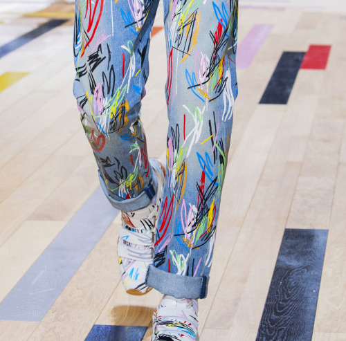
These pants were presented by Dior Homme in the S/S 2015 collection. its of interest to me for two reasons. One is the level of color happening here. Its another image that supports the challenge to traditional men's dressing concepts, allowing greater, more free use of color, particularly in trousers, which have been pretty safe these many years, sticking to a narrow, mostly dark palette. The other reason is that the pattern is a straight up re-issue of the 1980's. That sort of scribble effect done in bright color is one I remember quite well myself. And here it comes again. Everything gets recycled.
Jewelry designer Wallace Chan created this remarkable brooch. Called, "The Mighty" this is mounted on a red gold frame with two large baroque pearls helping to create the body, with the rest of the body and legs covered in diamonds, sapphires and rubelites. One the one hand, we keep wanting to copy nature in our various crafts, but we cannot leave it alone. If we are going to reference it, we seem compelled first to change it away from its actual aspect, into something strange and new.
Two gents, both ferociously stylish, but both entirely of themselves. Its interesting to wonder how they would look if they exchanged outfits completely. How would we feel about them; and how would they feel about themselves? When clothing suits someone fully, as these two ensembles seem to suit these two men, its difficult to imagine someone else working the exact same thing to the same degree of success. Conversely, when we see someone dressed in a manner that doesn't align with their personality or demeanor, we can tell instantly, though we usually aren't sure why we know it.
My sweet fella passed this one along to me recently and I HAD to include it this week. As far as I can see, these really are in the wearable art category, not a true Attire item, but they have tremendous emotional power, and a good deal to say about a lot of issues we are dealing with of late. Things like animal cruelty, gun violence, women's equality, and even a hint of eco-consciousness. Amazing that so much information and thought can be packed into one superficially silly thing.
I found this image from Wonderland Magazine interesting, as it exemplifies how much, and how far the presentation of men in fashion has altered as we've moved along. Sure, we still get the overused loner in a run down gas station/diner/barn/factory trope trotted out routinely. But now we are seeing an entirely other view of men showing up. Sure, you can call it twee, or effete if you wish, what's important here is that its happening at all. Its an indicator of an underlying change in how we are viewing men, and how they are beginning to think of themselves.
And for my last trick,...
Yeah, I know, is this an Attire word? Well yeah, actually it is; even if only a few dozen people have ever gotten to use the word. Its an x-ray of the flight suit worn by Alan Sheppard in 1961 for his Freedom7 orbital mission. Part of what strikes me about this is that though its design was not intentionally aesthetically pleasing, it managed to somehow be so. Its a tough, specialized garment that was meant to experience rough use, and survive it whole. Perhaps that is some of what I'm seeing, the underlying tenacity, and support that is a built in part of this object.
So that rounds out this weeks foray into my head. Have an amazing weekend all!
Friday, June 5, 2015
Naked Dress
I talk endlessly about the Attire language and what it means. But there is an aspect of Attire I rarely mention. We like to think that when we divest ourselves of our clothing we have freed ourselves from the constraints that apparel brings to us. But that isn't entirely so. Almost none of us are every completely naked. Not even in the shower, not when we sleep; we are still in some ways. dressed.
Like many men, I'm circumcised. (I know, TMI) I had no part in that decision, but it does mean that my body is different from when I was born. My essential form was altered to conform to a religious dictum. It a body modification, just like tattooing, or scarification. So that tribal tattoo on your arm, dude? Yeah, you're always dressed.
Similarly, what we do with our hair is something we don't take off ever, but if our hair is cut in a particular way; colored, curled, straightened, moussed, sprayed, spiked or shaved off, we are dressed.
Had any "work" done? Yep, you're always dressed, forever engaged in the Attire conversation.
Do you spend untold hours sculpting your form at the gym? Ditto, dressed, always, even in the shower.
Then there is make up, tanning salons, and lotions, manicures, pedicures, piercings of all sorts, and the recent appearance of body mod by having things implanted under the skin, all these things mean that even when you are naked, and alone at home, you are a part of the ongoing conversation.
It makes me think about the recent furor in San Francisco about public nudity. None of those folks who were out there, were fully naked, ever. So, what do we mean when we say naked? It seems that we mean that state we reach when our primary and secondary sexual aspects are in full view.
As well, this is the first place where our re-imagining of ourselves happens, right at skin level. We take the out of box goods and start tarting them up to make them more appealing in one way or another. So as I was saying in yesterday's post, this kind of thing rolls back to the very earliest part of our socialization as a species. Which means its the hardest to let go of, the most deeply programmed stuff. And its an object lesson in how far reaching, and how pervasive this whole language is.
Thursday, June 4, 2015
Person/Persona
The line we draw between our person and our public persona, is a hard one for us to delineate. Yet nearly all of us have this divide to one degree or another. We choose a style for its ability to conceal our perceived imperfections. We do our hair in particular ways to accent the best parts of our facial structure. And many of us, because of the requirements of our work, have essentially two entirely separate wardrobes; one that serves our work persona, and one we think of as our "real" clothes.
Part of my point here is that those real clothes may only be somewhat more real than our work drag. Even though we aren't trying to impress the boss, or present a professional image to a client at a meeting, we are still making an effort to present a certain aspect of ourselves, that we want to promote to the world as being "us".
Part of what I find endlessly interesting, is that this subterfuge we all indulge in is a socially acceptable, understood kind of lying. "This is not who I actually am, this is just what I am willing to let you see of me, and that, is manipulated through textile, color, texture, and fit to propagandize me to you in the way I wish."
Why is this so acceptable? I think its mostly because we have been universally at this for so long. It comes from the very root of our whole involvement with Attire, and that, is lost in the furthest reaches of our past. Besides, the nature of Attire as a language is largely composed of these deceptions. The assumption of power, the presentation of sexual allure, the expression of emotional states we may or may not be feeling, all are essential to how Attire works. We could no more excise this visual lying from Attire's structure, than we could wish to cease communicating our thoughts.
Because I'm basically a pollyanna, (I admit it freely) I choose to see this, not as a negative about our species. What it represents to me is something altogether sweeter. Its part of a vearning we have to be loved, and acknowledged. We all want to be seen, felt, understood and appreciated, and since we want to be lauded for what is best about us, we lift those parts of us up, and push the bits we feel are less desirable, into the darkness.
What that means is that, with few exceptions, we are engaging willingly in this process of self advertisement all the time. And with that comes a good deal of blurring of lines. The marks between what constitutes our base line self, and that which we have to a degree constructed, get harder and harder to find.
So, do we become our own fantasy of ourselves in time? I think to a large extent, we do. Is that a bad thing? Not always. There is a danger though of losing oneself in the fantasy, which we have seen many times with people in the public eye who become so attached to, and identified with their persona, that the real them fades, rarely to be seen, even by themselves. And the result is usually disastrous. I suspect that the more famous one becomes, the more care one has to give to keeping those markers between person, and persona, in clear view at all times.
Part of my point here is that those real clothes may only be somewhat more real than our work drag. Even though we aren't trying to impress the boss, or present a professional image to a client at a meeting, we are still making an effort to present a certain aspect of ourselves, that we want to promote to the world as being "us".
Part of what I find endlessly interesting, is that this subterfuge we all indulge in is a socially acceptable, understood kind of lying. "This is not who I actually am, this is just what I am willing to let you see of me, and that, is manipulated through textile, color, texture, and fit to propagandize me to you in the way I wish."
Why is this so acceptable? I think its mostly because we have been universally at this for so long. It comes from the very root of our whole involvement with Attire, and that, is lost in the furthest reaches of our past. Besides, the nature of Attire as a language is largely composed of these deceptions. The assumption of power, the presentation of sexual allure, the expression of emotional states we may or may not be feeling, all are essential to how Attire works. We could no more excise this visual lying from Attire's structure, than we could wish to cease communicating our thoughts.
Because I'm basically a pollyanna, (I admit it freely) I choose to see this, not as a negative about our species. What it represents to me is something altogether sweeter. Its part of a vearning we have to be loved, and acknowledged. We all want to be seen, felt, understood and appreciated, and since we want to be lauded for what is best about us, we lift those parts of us up, and push the bits we feel are less desirable, into the darkness.
So, do we become our own fantasy of ourselves in time? I think to a large extent, we do. Is that a bad thing? Not always. There is a danger though of losing oneself in the fantasy, which we have seen many times with people in the public eye who become so attached to, and identified with their persona, that the real them fades, rarely to be seen, even by themselves. And the result is usually disastrous. I suspect that the more famous one becomes, the more care one has to give to keeping those markers between person, and persona, in clear view at all times.
Wednesday, June 3, 2015
Walter Plunkett and History
Like so many designers of clothing and costume Walter Plunkett trained in another field entirely. He studied Law, but soon found he was more interested in theater, so he shifted to acting, costume, and set designing. What makes him interesting is that the primary focus of his 150 film long contribution to Hollywood, was historical drama. He was without question THE go to guy if you wanted your film to look historically accurate.
Was his work relentlessly accurate in its portrayal of the various periods he designed over time? Nope. No one's was, really; and it rarely happens today. What he brought to his work though, was an intense understanding of the aesthetics of the periods he designed. He "got" them in a way many others did not. Though he made concessions to the need of Hollywood to put their stars out there in ways that were still accessible, and understandable by the public, he stayed as close as he could, to the time and place. Where someone like Gilbert Adrian, brilliant as he was, indulged in more fantastical visions of the past when it was required of him, Walter Plunkett remained the most sought after designer when it was accuracy you needed.
His work on Gone With The Wind is considered to be extraordinarily on point, though it wanders from fiercely accurate, to wildly inaccurate. Interestingly, its in the costumes of smaller character roles and extras, where the level of attention to historical honesty goes up significantly.
When we get to Scarlett and Melanie, well, the desire to move story forward, and promote these two actors for their charms, overrode the need to be precise.
The most egregious failure is also one of the films most important costumes, the red dress Scarlett is forced to wear to the birthday party. Apart from its vestigial bustle, it bears no relationship whatever to the fashions of the time. It is, however, a massively potent piece of theater, and as such a huge success.
Another film he designed for is one that has faded from notice; a 1956 film called Diane, with Lana Turner in the title role, playing Diane de Poitiers, Countess de Breze. The men's costumes from this film were, uncharacteristically for Hollywood, quite fine.
But, as usual, its the women's costumes that really shine. The two major female roles, played by Turner, and Marisa Pavane as Catherine de Medici, are, apart from the very mid 20th century bodices with their nose cone breast shapes, remarkably true to the time.
The point here is that no designer ever expresses a historical period with complete honesty. Its not possible, really. Unless you had the budget to have textiles woven exactly as they were, by hand, and have all the costumes assembled entirely by hand, with hand embroideries, hand made lace and such, using the same dyes that were available, then you can't truly get there.
In addition, each time has its own way of seeing things, a dominant mindset that informs everything about that time, visually. And no matter how careful a designer is, tiny hints of it creep in, subtly shifting what we see to a more appealing direction. We may think we're looking at the truth, but its at best, an unintentional misdirection.
Tuesday, June 2, 2015
Monday, June 1, 2015
Shifting Views
When I came across this series of portraits by photographer Tim Walker I was struck instantly by one thing over every other consideration; the power of garments to shift us to another place, make us another person, or allow some hidden aspect of us to emerge for a time. In each case here, the person has been morphed into another version of themselves, or perhaps someone, or something else, entirely. And we, as observers, because we are humans, right off, begin writing a narrative to fit the new image of the person we are seeing. Whether that story we are writing has any connection to the viewed other, or not, is immaterial. What is substantive, is that we realize intuitively that we are being told a story, and being voraciously curious, and more than a bit impatient, we can't wait to hear more of the tale we are presented from the person presenting it, so, without that input, we make up our own.
I am suggesting here, that you take a few minutes and peruse these images. Each has a definite story to relate. Those stories are deliberately extreme, nearly comedic, but all of them are compelling.
Though its completely true that in each case, the position of the person, and their expression, adds greatly to the final statement, the same person in exactly the same pose, would be transmitting an utterly different message, if differently dressed.
Let me know what you think of these folks and what they have to say.
Subscribe to:
Posts (Atom)


