Saturday, February 27, 2016

Scatter #93

    Good morning and Happy Saturday, it's time for everybody's favorite activity; guessing what random stuff falls out of Paul's brain.  It's been a wacky week, so let's just see if that reflects itself in the scatter choices, shall we?
    I'll start you off with something easy.  This is a fashion shot from 1958.  The two coats are emblematic of two differing, but very popular shapes for the time; the reed slim columnar line, and the coat with significant back volume that arcs out from the body.  Both coats exemplify a time when the choice of outerwear was far more significant than it is now.  Dressing for town was a much bigger deal, requiring closer attention to detail.  It was socially required to put your best self forward when you were on the city streets, so considering what coat to purchase was a major question.  For most women, this meant not only finding a style and color they liked, but taking into account the sort of clothing it would be worn with.  The idea that we had to look fully pulled together when we walked the city was about two things, to my mind, one was simply about being socially acceptable, about fitting in.  The other was a subtle nod of respect, not only for those who were seeing you, but for yourself.
    A few days ago on the facebook version of Attire's Mind I posted a pair of white satin breeches from the early 1800s.  Here is an example of the last time that breeches had any serious use in the Attire language.  These are what was referred to as Plus Fours, which were very popular in the 1920s for outdoor sport, particularly activities like hunting, fishing, and golf.  They were normally worn with over the knee socks, and sturdy brogues.  The amount of volume in the leg allowed ease of movement, and the removal of volume from the lower leg made moving through wooded areas easier.  They remained in use only for a decade or so.  By the mid 1930s, they had been relegated to silly old fogey status, and slipped out of use entirely by the 1940s.  There have been a few attempts since to bring them back to use, always without success.
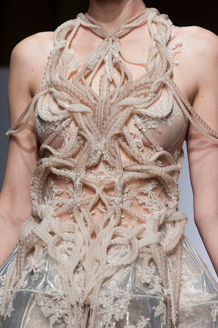
    Beautiful and disturbing.  It's amazing how dense the level of reaction to something like this can be. For me, my response to this covers many things.  First, the interplay of luxe embroidery work and modern materials, like the transparent plastic of the skirt creates a nice tension that I find appealing.  The twining lengths of beads, encased as they are in sheer fabric tubes take on an organic feel that is slightly unsettling to look at, mostly because of the color. It looks like viscera.  Associated with that, the organic look to those twisting forms implies that they might be snaking over the body of their own accord, which is an uneasy thought of its own.  For all that, it remains a beautiful object.  Imagining it in another color, it would take on entirely different meanings, but still be lovely.
    A trope that keeps surfacing in design is that of deliberate bedragglement.  In these often confused and difficult times, gestures like these take on a much darker subtextual meaning.  They remind us of poverty, homelessness, mental illness, and societal conflict, so they are uncomfortable for us to look at with dispassion.  Of course the other aspect that makes us squirm a bit is that clothes like this are fabulously expensive garments, made to be worn by people who have no contact with any of the uncomfortable things I mentioned.  So they are also a visual slap in the face, as well as a statement of blithe unconcern.  That they can at the same time be meant as a social satire is part of why the Attire language is so fertile, complex, and expressive.
    This gaudy object is the crown of Empress Eugenie who was the spouse consort of Napoleon III of France. during the mid 1800s. Designed by Alexandre-Gabriel Lemminier in 1855 it bears eight gold eagles with wings aloft.  The decorations include 56 square, and round cut emeralds, and nearly 2500 diamonds.  The court of Napoleon III was known for the extremity of it's lavishness, and for a certain florid taste.  This crown is a perfect example of the "over the top-ness" of the court.  It is almost as if, by pushing so hard with display they were trying to convince not only others, but themselves about their power and importance.
    This is a detail image of a Louis Vuitton design from several years ago.  What made it appeal to me is the ferocious intensity of the colors in use, and how they affect emotion and opinion.  Orange is a difficult color for most to pull off since one of our gut level responses to it is uneasiness.  Pairing it in equal distribution over the pattern with that orchid violet, and with black changes the messages possible.  Our associations with purple pertain to royalty, and also to intellect.  Black is a color associated with mystery, and danger.  Put these three colors together and suddenly there are complex stories that can be told, myriad emotional states.  How we interpret the colors in the fabric depends largely on the rest of the sartorial words that get used.  Carrying this bag, for example lightens what might be a dark message, because of the bright flowers that look as though they were lifted from some east European ethnic costume.
    We really cannot stop ourselves.  We keep coming back to this.  We seem to have a segment within us that can't stop trying to refashion ourselves into something fantastical, magical, or surreal.  Perhaps it is simply our unbounded creativity and curiosity.  Certainly in this particular costume there is a strong aspect of sexuality, both in the choice of fantasy creature, and the way it's realized.  We never stray too far from our primal selves, no matter what we may think. It lives within us all, just waiting for it's moment to come out and play.  For some of us this is an aspect we embrace, for others, something fiercely denied.
    This object is part of the collection of the Victoria and Albert Museum in London. This corset is from one of the final points before they changed shape to encase the hips to a degree.  Prior to the drop to the hip line corsets finished right at the waist point.  This one is from the 1860s. It is covered with bright royal blue silk moire', also known as watered silk, and trimmed with hand made Broderie Anglaise.  Another thing of note is that after this point the corset rose in front creating the mono-bosomed effect that typified the remainder of the century.  This was the last time that a woman's breasts we separate from each other visually till after the beginning of the 1900s.  Scholars have equated this merging to the general lack of willingness on the part of Victorian culture to mention anything whatever having any connection with sexuality or procreation.
    Like any art, applied or fine, it is part of the purpose of it to occasionally disrupt our composure.  This image is from a 1998 Alexander McQueen collection. The aluminum lower jaw jewelry is a deliberate act to get us to ponder what exists beneath.  It is also in profound contrast to the clean lines and exquisite nature of the model's suit, and his grooming.  The mouthpiece is rough, and looks like it might even have been cast from a real jaw, which only intensifies the effect on us.  Though such things are unlikely to become used words in the Attire language, it is vital that they exist, even for a small moment of time to make us think a bit, and keep us a trifle off balance.
    It is often the case for me that it is a detail on something that captures my eye and won't let me look away.  In this instance it is those silk roses.  Each one is crafted by hand, petal by petal, and the finished product is so realistic you could easily imagine dew on them, or a bee being convinced of their truth.  The hat is from the famous Paris milliner Mme Virot who was so successful, and so skilled she could maintain a shop on the Rue de la Paix, still one of Paris' premiere high end locations for retail.  Made in 1902, this beautiful silk and linen summer hat is perfectly proportioned, and expertly trimmed.  It's in the collection of the Metropolitan Museum of New York.
    Even I, sometimes am left scratching my head in confusion.  As a concept, the interplay of fluid and rigid, translucent and opaque, I completely understand.  There is even an aspect of surrealism in the way the front of the jacket works with the applied front that looks like a biker jacket.  I get that.  Another point where I have concerns is that the jacket, with it's fur collar and metallic brocade is all about extravagance.  The lace skirt looks like it was made from very low end goods, or at least they were not worked up in a way to enhance them.  Where my confusion comes from is that these disparate elements contain no point of harmony.  There is no single thing that makes these all relate to one another, so it becomes a visual gibberish that will not allow us to parse it out.
    As a final entry today something that just made me smile really big.  Manish Arora is one of the many designers who are sending men down womenswear runway presentations, and vice versa.  This men's ensemble walked the runway for his S/S 2016 collection.  There is not a single thing here that I don't totally love.  Each piece contributes equally to the finished visual statement.  And being the color whore that I am, this makes me very happy indeed.

No go on out there and have some fun!


Wednesday, February 24, 2016

Glories

    There have been up periods, and down, for headgear.  Some eras are not particularly fertile, while others overflow with graceful, witty, inspired design.    The 1920s, though it was a substantial, and important period in design, had less variety with its hats than others.  Perhaps that stems from the singular focus on the cloche style, whether brimmed or not.  Once the 30s dawned and in particular because of Surrealism we were off and running again, and hats would be some of the most creative of the entire 20th century.
    It is the end of the 19th century, and into the beginning of the 20th that I want to focus on here.  It was a time of extreme extravagance, if not wholehearted artistic inspiration.  It was often the case that the Victorian aesthetic required more of everything, rather than perfected proportion, and editing.  The results were sometimes so huge that women looked as if they might be about to be swallowed under them, but when they were right they were so very right, that they stand alone as works of wearable art/sculpture. 
    Employing wire, straw, felt, and buckram to create base structure, these chapeaux were laden with ribbons, flowers, plumage of all sorts, wax fruit, whole birds, furs, laces, nettings, crystals, beads, and embroideries, (sometimes a good many of these at one go).  So a custom made hat of this sort was both a fabulous expense, and a literal top off to the visual statement of wealth and status a woman meant to convey.  If made today, some of the hats you see here would cost several thousand dollars.
    Apart from the image of status such hats relayed, there was the near instant sense of confidence that comes with knowing that a hat really suits you.  It made you lift your head, stand straighter. This is what a great hat really does.  It makes us want to be our best selves, to strut it out there in the world and say. "check me out".
    This period in hat design was all about that. Sure, headgear also relayed position in society, and personal tastes, but the most important thing that got transmitted was the desire to stand apart from others in some way, to have a unique expression.
    Herewith, some of the glorious, silly, and lovely creations of that time.   Try to imagine yourself in one of these.  How would you feel about yourself, and where would you be going?


Monday, February 22, 2016

Complexification

    We began, untold eons ago, as a simple tribal species.  We existed separate from each other, largely.  Our entire existence was bounded by a few miles here, and there.  That changed.  Once we domesticated animals, (mostly horses, donkeys, asses) to our use, we ranged further. Then we set sail.  We scraped the seas, slowly, it is certain.  Once the Industrial Age dawned we set sail again, but this time in ships that had motive power delivered by steam.  Transiting the seas took a few weeks, then a few days, rather than months.  We surged across the landscape on trains, similarly powered. And when the Twentieth Century dawned, we took to the air.  We made it possible, even in those early times, for a person to cover the waist of the world in a few days.
    How does this reference Attire?  Because this language we use each day has done the same thing. Our association with differing cultures has informed, affected, and substantively shifted our manner of dress. As our world view has broadened, as we have become more aware of the myriad cultures that exist on this fragile planet we call home, we have been involved, (unbeknownst to our conscious selves), in the process of complexification.  We are not the simple folk we were in eons past. We know too much. We have seen too much. And we have experienced too much for us to be able to cleave to some simplistic view of Humanity. We can no longer completely embrace the idea of our being in some single image world. We have, for good or ill, expanded.  It is quite true that this inevitable expansion will cause pain, dissonance, and for some, a relegation to the sidelines of life.  We move either with, or against the tides.
    We have a choice before us.  We can choose life, moving forward, and an embracing of change, or we can choose to stand our ground, dig our Jimmy Choos into the earth and say NO.
    I will say this to you.  Look at human history. Look at what happens when people have refused to change throughout time. If you do not change, you die. Period. That has been proven over, and over.  Those who refuse to alter are consigned to the shadows; left aside.  Desiring to have things as they were, rather than as they are, is a futile exercise.  Life moves forward. It doesn't end up mattering one little bit if you like it that way.  The bottom line truth is this, "grow, or die".
    We have entered into a phase of global existence that challenges us all to shift, change, and morph into something new.  I have no idea what that is going to look like. I would be a supreme fool to say with certainty that I do.  What I feel I can say with confidence is this.  We are reaching a point where old ideas of nation, religion, and society are losing their grip.  If we really mean to become this global society, this single human family that 2000 years ago Alexander imagined, then there are things we must let go of.
    For the Attire language the things that must slide to the sidelines are these; binary sexuality, societal position based on manifest image, and the idea that a single manner of accoutering ourselves is the exclusive province of one place, and one people. The notion of nationalism must die if we are really to move forward. We must embrace the idea that all of the world is our right environment.  We are all one Human Family. Sequestering some of us to one manner of apparel, while others have more freedom is unfair, unloving, and divides us all from each other.
    We have seen greater and greater experiments with cross-cultural dress.  We have all seen, and perhaps indulged in the acquisition of items belonging to another society.  It is time for us to drop our fierce control of these things, if we really mean to gather each other into a single world family.  Our survival as a species now depends o giving up these old notions of division.  We Are Us.  We deserve each other, and can only survive with the cooperation of each other.  That includes how we express ourselves with our Attire.
    It is inevitable that as our society has become more complex, the manner of our togging ourselves out would become so as well.  We perceive more deeply, know more broadly, and as a result the way we put ourselves out into the world becomes more layered.  It is common for people to have items on their person that come to them from differing cultural sources, even when they do not know that is so.
    As a small example, This necklace I made for myself had items in it that come from two different continents and even more cultural sources.  But, if I had bought this at a shop, I might not know it's provenance.  The pendant is a piece of antique Czech glass, some beads are from Africa, some from Japan, and some from Russia.
    Whether we like it or not, our lives have become far more Byzantine in their convolutions. We must and will adjust to this increase in layering, and meaning.  Our children will surely be able to understand the nuances.  Until then, we must muddle through, trying to make sense of each other in the best ways we can. The Attire language can help, if we let it.

Saturday, February 20, 2016

Scatter #92

    Good morning!  Welcome to this week's pile of curiosities. No matter how many of these I have done, I always seem to find more things worth looking at, and commenting on. Oh those endlessly creative humans, they supply me with more than I could ever remark on.  But enough of that. To work!
   
    First in the queue today is this example of a traditional Russian headdress called a kokoshnik.  It was mainly worn in the northern parts of Russia, and was in greatest use between the 16th and 19th centuries.  Shapes varied wildly from halo-like, to square, to pointed.  This particular one is from the 1780s. This one is especially lavish since it is decorated with extensive gold work and masses of pearl embroidery, as well as the traditional pearl fringe at the forehead.  As ethnic traditional head gear goes the kokoshnik is one of the most extravagant, and expressive.  These headdresses were worn by married women, and could be decorated with anything from plain applique of floral forms, to silk embroidery, to the sort of over the top version we have here.  Here in the 21st century they have been relegated entirely to folk costume status, only appearing at festivals, historic reenactments, and of course, Russian opera, and period film.
    Backstage at the Dior Homme 2016 F/W runway.  Here are four of the models.  I am struck by the shift in how males are being presented here.  Instead of the burly dude thing, we are getting fragile hothouse flower.  And the clothing, though based on very traditional menswear concepts has been tweaked to discharge some of the standardization that plagues most men's design.  In particular I like the idea behind the red coat.  Taking a motorcycle jacket and extending it to overcoat length diffuses a lot of the macho charge appended to it.  of course, teaming it up with a western style tie, a ski style sweater and fingerless gloves helps a lot.  It just interests me that this delicate male image is not a trope we have seen much of late.
    This ball gown is from 1988.  It appeals to me for a couple of reasons. One is the use of a traditionally casual textile pattern, gingham, which we associate with summer, picnics, and farming.  The other is how the fabric has been manipulated through weaving it in strips into a massively over-scaled houndstooth check.  So we get a completely different textile reference laden on top of the first one that allows this finished garment to essentially relay two different things at once to the observant viewer.  Part of what makes this work so well psychologically is that houndstooth check is most often a woolen fabric and it is associated with outdoor life, just like gingham is.
    This is a man's suit from 1630.  Aside from it's rarity for being so old, it is also unusual for it's being entirely white.  This suit is from the period when men's and women's clothing was placing the apparent waistline just at the base of the ribcage.  Looking at this, you can see that the waist point has been lifted above the elbow line. It also makes the body appear broader through the middle, while extending the leg line.  It was curious mode that skewed the body proportions.  The suit is completely covered in finely worked quilting, and still has its original ribbons.  The bows you see are ribbons attached to the breeches, and drawn through eyelets at the waist of the doublet to hold the two pieces together. There have been assumptions made that this was a wedding suit, but there is no substantiation for it.
    Designer Popy Morena created this pleated gold ensemble in 1983. Taking cues from the then emerging Japanese designers like Rei Kawabuko and Issey Miyake, Morena created an interestingly sculptured shape from the gold textile.  As an experiment with this unique aesthetic, it is laudable.  I'm not sure it's entirely successful. There is something that doesn't seem harmonious to the finished piece about the way the torso is wrapped.  Perhaps if I saw more images of this it might resolve my concerns.  That said, it's an arresting look and a fine effort.
    Here I go again about the slow blending of apparel choices as we explore our ideas about non-binary sexuality.  Jewelry for men has been an expanding category for some time, and This is just taking that to the next logical level.  If a necklace, or a bracelet are okay, then why not a statement necklace, or bracelet? Why not both?  This is an interesting direction, and I wonder if it will take hold in the mass market?  Grace Wales Bonner, F/W 2016 Menswear collection.
    This is such a curious construction. Though it is clear that this is supposed to present a woman as super duper sexy, it ends up being curiously sexless.  The corset bodice with the emphasized boning should take us to Sexytown.  The uneven frill of fabric at the top, seems to stop that process.  The expanse of leg, which could be highly charged, doesn't spark in the way it should because the huge mass and complexity of the rest of the skirt pulls the focus away.  The choice of varied shades of gray for the layered frills, has it's own visual impact.  The whole piece drops down in terms of its ability to confer sex goddess status because of the feelings we get from gray.  Gray tends to make us feel inert, passionless.  It's an odd juxtaposition, that could work in another form but doesn't in this one.
    Roger Vivier was one of the most influential shoe designers of the 0s through the 60s, partnering most famously with Christian Dior, and then later, with Yves Saint Laurent when he opened his own house.  This brogue style shoe is made of gold kidskin that has been covered with gilded wood.  What makes the design actually functional is the narrow spaces between the wood strips that allow the shoe to flex as it should.  Even under the best of circumstances these would not be long lasting, but they sure have a strong message to convey.
    This memento mori pendant was created in 1500.  We have been making memorials to our loved lost for as long as we have been around as a sentient species.  We have been making jewelry for this purpose nearly as long.  It's really only in the 20th century, with the easy availability of both photographic and film records that the practice slid into disuse.  This pin, it seems likely, was not made for a specific person, but rather was made by a jeweler as a sale item for their place of business, that could be used by anyone in the mourning state.  The pendant is of gold, with carved rock crystal, glass, and a tiny figure of a skeleton holding a staff, and an hourglass.  The workmanship is good, but not superb.
    Though I can't imagine how long it must take to get into and out of all of this, I gotta say I love the interplay of the Japanese inspired, overlapped layers of the jacket, vest and shirt, with the more western traditional cut of the coat and pants.  It's a kind of cultural merging that I appreciate.  What gets created is a harmonious new synthesis that I find very appealing in this instance.  And, oh yeah, that BLUE!
    This artifact could stand on it's own as a piece of sculpture it is so beautifully balanced in every respect. This is a dress bodice for a small girl from between 1720 and 1735.  The cut is sublimely simple. The magnificent textile is positioned perfectly and is immaculately sewn.  Whoever the unknown dressmaker was, she deserves very high praise.  This bodice is also a not very gentle reminder that little children wore corsets just like their mothers did.  The amount of constriction was slight for children's corsets, but it was thought that training was needed to be able to wear an adult corset.  It was also a handy tool for encouraging good, erect posture.
   
    This last item is quite a rarity.  Though we have many splendid examples of printed or embroidered waistcoats from the 1700s, this is one of a very few examples of a waistcoat whose pattern has been specifically woven to be made up in the manner it was made. The technique is referred to as en disposition, and it allows a complex pattern to follow specific garment shapes without interruption.  In cherry red silk, the brocaded pattern is a riot of flowers, leaves and branches in gold metallic thread, red, green, brown, and blue silk.  Made in 1733, this is also from the period when waistcoats had sleeves.  The fashion was such that the sleeves of the coat were slightly shorter, allowing the decorated cuff of the waistcoat to be seen, and admired.

So that's the lot for this week, folks.  I hope you enjoyed this wander.
Now get away from your computer and go have some fun!