Once more into the breach, dear friends! Here we go again with that weekly tour through the detritus of my brain. I pick up random stuff and throw it into a pile, and cart it here for you to peruse.
So, shall we?
We live in a body obsessed culture, it cannot be denied. Perceived imperfections are worked out till they vanish, and then must be displayed with clothing that is not only trimly cut, but has cut outs so we can see part of how buff we've gotten even more clearly. Now, I must say, I have no issue, per say with cut outs in clothing, its how obvious a ploy it is that bugs me. Rant over. for now.

There was a time when fancy dress balls were a very big thing indeed, and dressmakers, couturiers and high end retailers all got called on to make costumes for well heeled revelers. This costume, which is part of the collection at the Fashion Institute of Design and Merchandising Museum, was made by the firm of Swan and Edgar between 1883 and 1887. The sweet, and lavish milkmaid outfit is made of creamy colored silk, and trimmed with silver metallic fringe and silver bullion embroidery. Such a costume would have been considered rather sexy, since milady would be allowed to have her legs on display. As well, its a marvelously romanticized version of what the 18th century peasant class wore to work.

I've both mentioned and shown examples of gold work before, but not the techniques in process. I came across this pair of shots that show some of the methods used. Yes its true that the embroidery is not being worked in gold strip or purl, but the techniques in play are identical. In all these cases here, the dominant thread is never going under the fabric, but is being held in place by tiny couching stitches. The padding you see in progress was often done in this manner, but also, if a more rigid shape was desired stacks of cardstock, or cardboard would be used with the gold work over them.


Giovanni Battista Moroni painted ths portrait of a young lady somewhere between 1560 and 78. Its a very formal portrait, and as such is designed to convey her wealth and status to an extreme degree. She is wearing a great deal of jewelry; probably considerably more than she would wear normally. earrings, three finger rings a pendant and a heavy beaded chain necklace, plus a very complex waist chain, that no doubt had either a mirror or a pomander ball encased in chased metal hanging from it near her ankles. And there is a subtle symbol present in how she is holding her. fan. half opened as it is, and held away from the body, it was a gesture of cautious interest. essentially she's saying, "You have my attention, tell me more before I commit myself."

Often it is one simple addition to the visual phrase being presented that takes something basic and turns it poetic. In this case, the young man's hat is doing the job of taking this achingly simple, commonplace combination of garments, and taking it somewhere personal, and expressive. Just a hat, nothing more. Not even a terrifically unusual one, just a good one, chosen well. Its this kind of subtle alteration away from the utterly typical that gives so much oomph to what we can communicate, with very little.

In 1914 ballerina Vera Fokina was shot for this promotional image, dressed for her role in Carnaval. What makes this interesting to me, apart from the obvious charm of the mage and the costume she wears is that, over time what has been designed for dancers to wear has altered substantively, just as it has in real life dress. It was, once fairly common that dancers would be required by their roles to wear masses of bulky clothing that made actually doing the hard work of dancing, that much more difficult. In the 20th century, we finally figured out that this was contrary to the aim of a dance production, and subsequently how costume for dance was done changed utterly. Now, if this ballet were to be performed, the costuming would be mush less complex, lighter, and easier to move in.
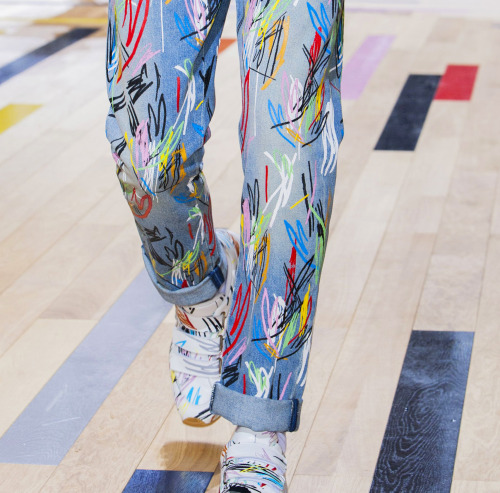
These pants were presented by Dior Homme in the S/S 2015 collection. its of interest to me for two reasons. One is the level of color happening here. Its another image that supports the challenge to traditional men's dressing concepts, allowing greater, more free use of color, particularly in trousers, which have been pretty safe these many years, sticking to a narrow, mostly dark palette. The other reason is that the pattern is a straight up re-issue of the 1980's. That sort of scribble effect done in bright color is one I remember quite well myself. And here it comes again. Everything gets recycled.

Jewelry designer Wallace Chan created this remarkable brooch. Called, "The Mighty" this is mounted on a red gold frame with two large baroque pearls helping to create the body, with the rest of the body and legs covered in diamonds, sapphires and rubelites. One the one hand, we keep wanting to copy nature in our various crafts, but we cannot leave it alone. If we are going to reference it, we seem compelled first to change it away from its actual aspect, into something strange and new.

Two gents, both ferociously stylish, but both entirely of themselves. Its interesting to wonder how they would look if they exchanged outfits completely. How would we feel about them; and how would they feel about themselves? When clothing suits someone fully, as these two ensembles seem to suit these two men, its difficult to imagine someone else working the exact same thing to the same degree of success. Conversely, when we see someone dressed in a manner that doesn't align with their personality or demeanor, we can tell instantly, though we usually aren't sure why we know it.

My sweet fella passed this one along to me recently and I HAD to include it this week. As far as I can see, these really are in the wearable art category, not a true Attire item, but they have tremendous emotional power, and a good deal to say about a lot of issues we are dealing with of late. Things like animal cruelty, gun violence, women's equality, and even a hint of eco-consciousness. Amazing that so much information and thought can be packed into one superficially silly thing.

I found this image from Wonderland Magazine interesting, as it exemplifies how much, and how far the presentation of men in fashion has altered as we've moved along. Sure, we still get the overused loner in a run down gas station/diner/barn/factory trope trotted out routinely. But now we are seeing an entirely other view of men showing up. Sure, you can call it twee, or effete if you wish, what's important here is that its happening at all. Its an indicator of an underlying change in how we are viewing men, and how they are beginning to think of themselves.
And for my last trick,...
Yeah, I know, is this an Attire word? Well yeah, actually it is; even if only a few dozen people have ever gotten to use the word. Its an x-ray of the flight suit worn by Alan Sheppard in 1961 for his Freedom7 orbital mission. Part of what strikes me about this is that though its design was not intentionally aesthetically pleasing, it managed to somehow be so. Its a tough, specialized garment that was meant to experience rough use, and survive it whole. Perhaps that is some of what I'm seeing, the underlying tenacity, and support that is a built in part of this object.
So that rounds out this weeks foray into my head. Have an amazing weekend all!


The costume in the (colorized) photograph of Fokina is actually a - period - costume. The progressive lightening up of ballet costumes is certainly true but, in this case, the bulk of the thing is mostly due to the ballet's setting, circa 1830.
ReplyDeleteOh I was aware of the fact that it was meant to be a period costume. But my point here is that such a dance costume today would be rendered in a different way so it could be much lighter and less cumbersome.
Delete