It's not very often that I post something that doesn't quite get all the way to it's intended point. I would rather focus on the positive, and so successes are more my thing, than not. That said, I do have to acknowledge that there are things to be seen, and learned from looking at the lesser efforts, the things that miss the target.
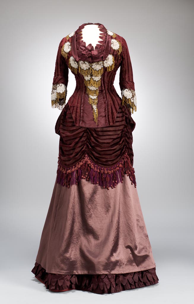
This dinner dress is from 1875. It's a great example of something that could have been great, but through some unfortunate design decisions, isn't great at all. What has to be said before parsing out what went wrong is that in terms of construction, there isn't anything to fault this. Whether it was sewn by the lady who wore it, or it was made for her by a professional dressmaker, the skill set on view is just fine.
Now, on to discussing the garment in detail.
Let's begin with the textile choices. There are three in use here, two solid color silks, and one silk with velvet stripes. Superficially these are fine choices for each other, it's the placement of each that goes off track. In especial the lighter colored silk that comprises the over skirt is used nowhere else on the gown, so it doesn't feel integrated into the whole design. Also, the weight of the material is such that it doesn't quite balance the visual gravity of the rest of the costume.
The second design issue is the asymmetrical draping of the swagged apron/bustle. Viewed from an angle, it doesn't appear odd, but seen straight on it looks like it has slid askew, though it's clearly intended to be off center. Two things could help this. One is setting one of the pulled up points directly on a major seam line in the bodice. The other is a slight increase in the draped volume.

The third issue is that of the ready made beaded appliques laden on the bodice. Nothing has been done to really make them seem an intended part of the design. They appear simply slapped on with little consideration for placement or volume. The fact that they are obviously store bought pieces that have been attached is enough reason for concern about the choices made. There are ways to make such pieces look fully a part of the garment. For example, a small decorative ribbon heading at the top of each one would work to draw them more fully into the design. Also, using a few less on the bodice, but taking two three and using them to mark the irregularity of the bustle draping would help.


The most important point here, is not about the garment itself and its rather clumsy finished appearance, but what it communicates to us, ultimately about the person who wore it. Not all of us have perfected taste, or an unfailing design eye. So though this dress is one that was clearly well intentioned, the lady who wore it was probably proud of it, and was just as probably blind to its deficiencies. It remains for us, as viewers, to understand and forgive, just as we forgive the lapses of our loved ones.
Often, in looking at these pieces from our past, it is the things that go wrong that humanize them. They remind us that these were not people from a story, but folk just like us with lives, foibles, and dreams.


I keep looking for the drawstring that would cause the Austrian valances to drop to the hem. Clearly the metaphor is "woman as window dressing."
ReplyDeleteWhat makes your comment even more appropriate is that they actually did sometimes make draping like this adjustable to the ladies need and taste.
Delete