After we learned to plain weave cloth, one of the very next things we must have learned how to do is weave another color back and forth on the weft, creating the first striped textiles. So, stripes and us as a species go back a long way indeed, deep into our own prehistory. Perhaps that's one reason why stripes continue to have such consistent influence in the Attire language. Certainly there are no cultures anywhere on earth that do not employ this basic design concept.
It must also be said that in terms of fabric production, stripes are easy to do, so they get a lot of play. Add to that the layer of familiarity we have with them, and its natural that we would go to them constantly.
But what is amazing about stripes, and really sends them to the top as an elemental design choice, is the power that they have to transform shape, create tension, and imply movement where there is none. Used in grand scale they can render the wearer into a piece of graphic, kinetic art. Employed in small scale they can subtly sculpt the body, fooling the eye about real proportion and size.
When stripes match to perfection across the frame, a sense of structural harmony is created that pleases us on a subliminal level. When stripes are ill matched, no matter how luxurious the material employed, we feel a disappointment that we can bring no words to, and a sly feeling of discomfort. Magnify that mismatching, and the sense of unease can grow, so that we feel disturbed, and even possibly threatened. We can even perceive the person wearing that garment as off center, potentially unbalanced.
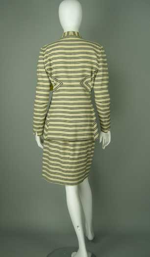
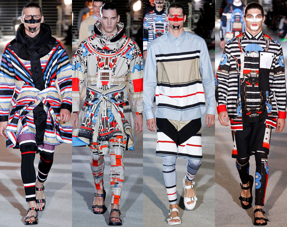
Vertical stripes extend the line of the body, conveying greater height, and also a sense of tempo, a regularity we always feel good about. Stripes used in horizontal positions express solidity and strength. Skew stripes to one or another angle, and they can communicate ascending or descending motion. Using stripes of varying width in the same fabric adds a rhythm that can become almost musical, either joyous, or somber. So when you combine stripes visually, all these factors come into play.
Utilizing striped textiles in more than one direction can also define physical form, enhancing the already present ability of such fabrics to fool the eye into seeing what is not there. Such complexities must be handled with the greatest care, since its becomes more and more easy for cacophony to develop when there are too many clashing cues.
Of course, the color combination of the fabric is important as well, in its conveyance of information. The same awning striped textile made up in black and white, is boldly dramatic, and eye catching. Make it up in two similar tones of dark green, and the message is profoundly different. Or, developed in say, a pale candy pink, and the message shifts yet again, bringing with it all our internal associations about that color.
Whatever color or balance is present, the dissonance between the stripe and its opposite number instantly relates an energy, and a potency we cannot ignore. Its inherent in the strength of the of the nature of striping that there is an energetic difference, whether that be color, size, or direction, that makes striped fabrics some of the most evocative we have to hand, because they are so direct. Floral prints can mire us in myriads of colors and allusions. Stripes are profound, clean and powerful. We, I do not doubt, will never give them up.


Some very cool things here!
ReplyDelete